
Two widget designs for a healthcare benefits enrollment enterprise application that could be applied as part of a white label platform for various client brands.
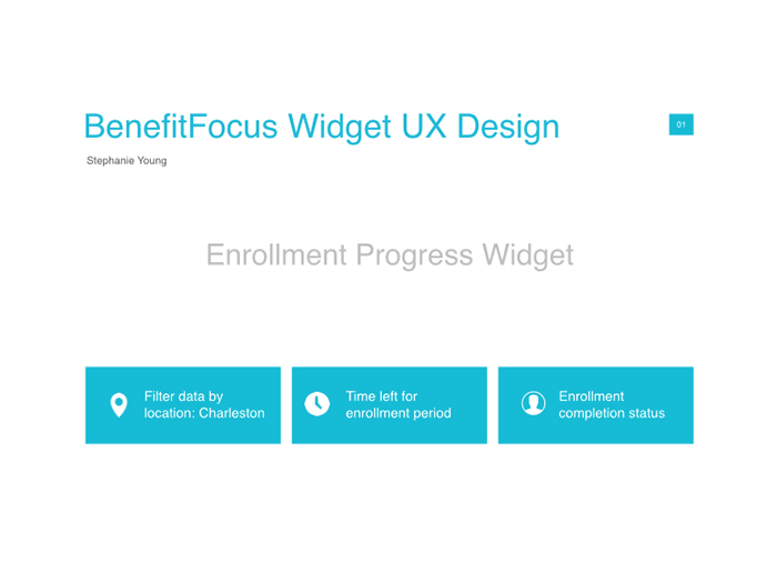
Open Enrollment: The first project is to design an open enrollment progress widget for a benefits administrator preferring a traditional, simple design. Benefits administrators needed to track enrollment progress as employees completed enrollments during Open Enrollment (a pereior during each year where an employer allows benefit-eligible employees to elect benefit coverage for the upcoming plan year). The benefits administrator wanted to understand what is happening with the eligible population in real time in order to identify additional communication strategies to unsure that employees enroll.
Enrollment Benefits: The second project is a product listing design for enrollment benefits packages. When an employee has the option to enroll in a medical plan, each plan has a set of key attributes to display to them (cost, deductible, copay, etc.) that inform the decision toward their elected plan. For this widget, the business identify that they needed plans to have the ability to be compared (up to four plans), with the ability to sort (explicitly using the words premium, deductible, coinsurance), see more information about that plan, and read downloadable documents.
Open Enrollment Widget Process
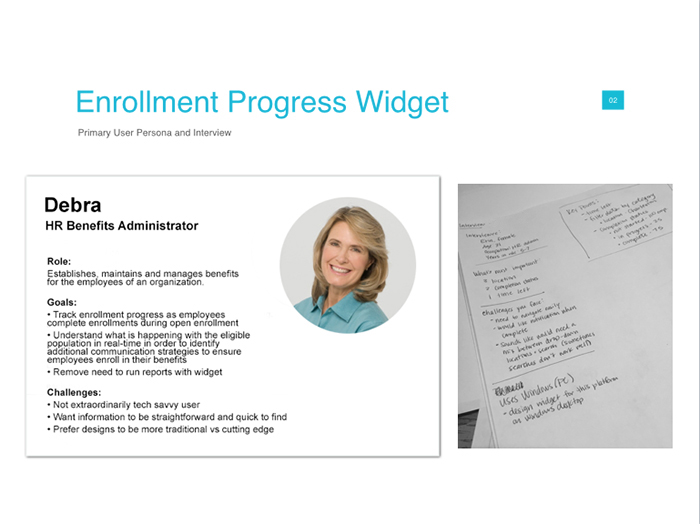
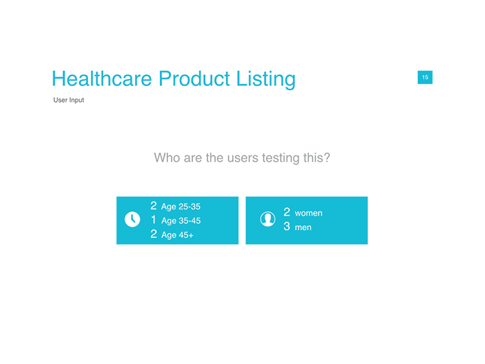
The design process began by first understanding the business requirements and the target user personas. The next few slides are from part of my presentation to key stakeholders to consolidate this information for background context.
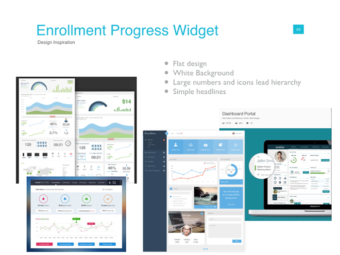
And then went into design inspiration to help others understand what is common in the marketplace, and to paint a picture for the influence behind the design direction.
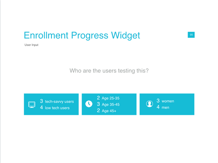
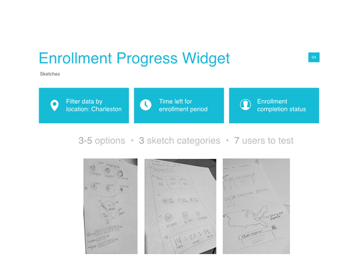
Then, the team did some user research to understand the personas deeper - created a screener that would include a wide range of users, and gathered information about our users as well as their feedback on our concepts.
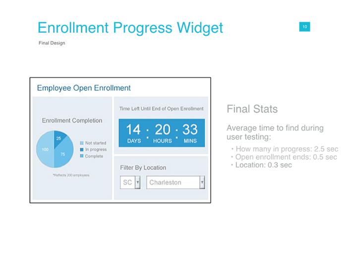
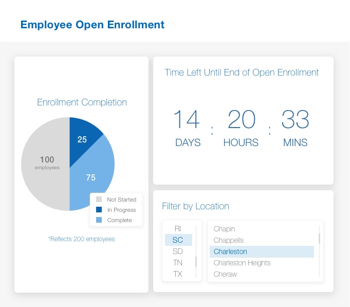
What we gleaned during this conversation is that the data needs to be understood in as quickly of a manner as possible, so the best way to tackle this from the user's perspective was through bar graphs, large numbers, and a classic drop-down menu to navigate through the location. Most users informed us that, regardless of age or tech-savviness, they would like to see the information in a way that's as familiar as possible.
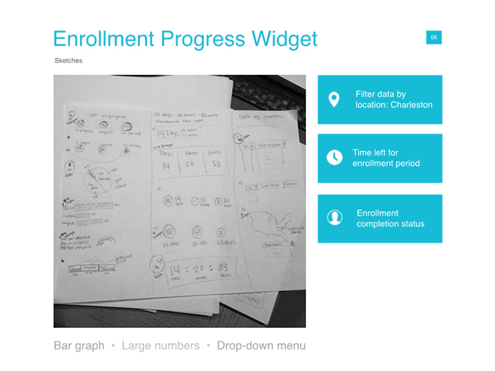
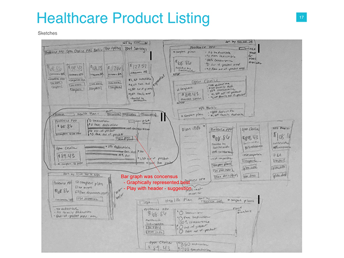
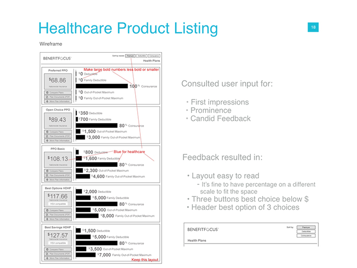
Feedback regarding the layout resulted in conversations on layout, wording of headlines, and ease of navigating the information. (While I'm showing how many concepts we worked through in sketch form, the users were instead shown more polished wireframe/lo-fi concepts.)
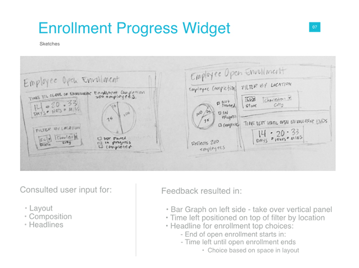
To keep track of these notes, our team also annotated these wireframes with comments as we interviewed, so that we could easily pinpoint comments in addition to the written notes and recordings.
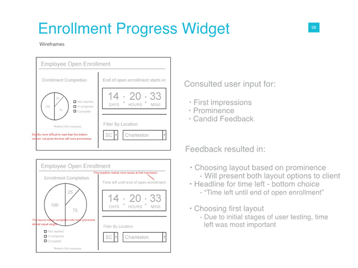
The designs continued to be tweaked and iterated upon based on user feedback and this was the final lo-fi state based on these conversations.
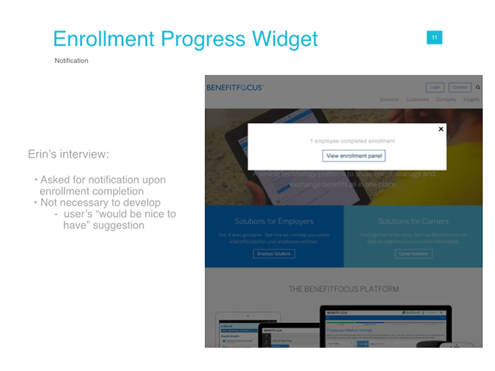
While this wasn't part of the MVP, I also captured noteworthy features as suggestions for the next phases of our roadmap and created lo-fi mockups so that we could place the screenshots into our backlog to reference.
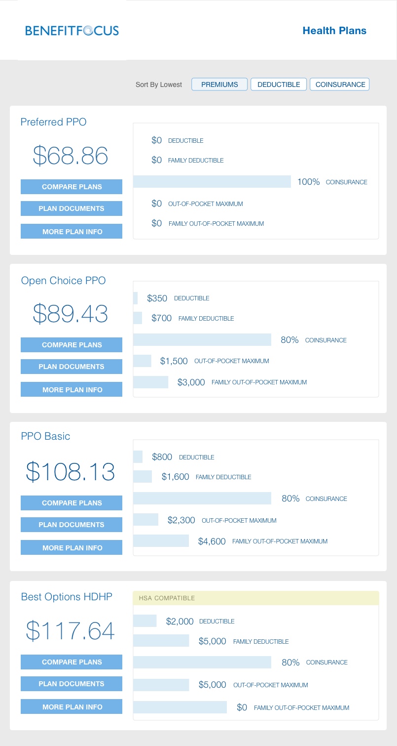
After getting approval from the stakeholder on the concepts, the design went into Hi-Fi mockups.
Enrollment Benefits Widget Process
We were working on the second widget simultaneously, so we went through the same process as we did with the first widget. For background context, the business needed a widget that showed a product listing for healthcare plans that would include premium, coverage, and network in a way that's easy for users to identify the items they need to make a good decision on which plan is best suited for them.
While some users might be in a corporate environment, different corporate users have different needs. For example, a single vs family plan. For a business owner who needs to help her users choose their plan, we need to make the process simple enough for someone in her company who may have never had to select their healthcare coverage before
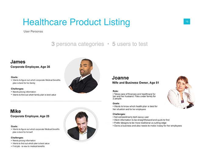
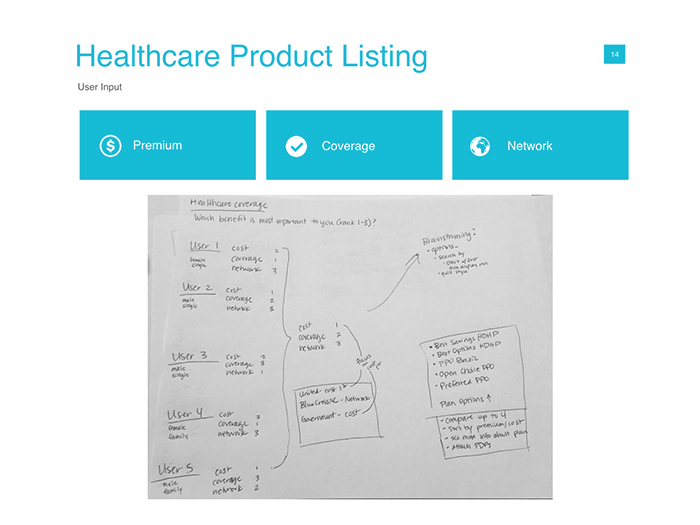
During my initial discovery research with users, I wanted to understand how each item ranked in order of importance to them.
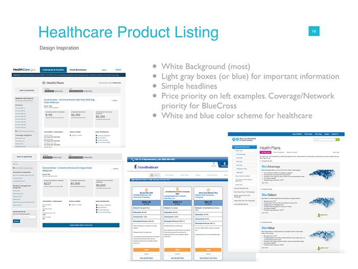
We also reviewed a competitive analysis and heuristic review to understand how other health plans were being displayed. We took design, content, and layout into consideration.
And from there, worked through concepts.
Taking these concepts into lo-fi, users provided more clarity and feedback on direction. During this time, we also speed tested the time it took the average user to find the information they needed, which was more rapid in an A/B analysis against competitors.
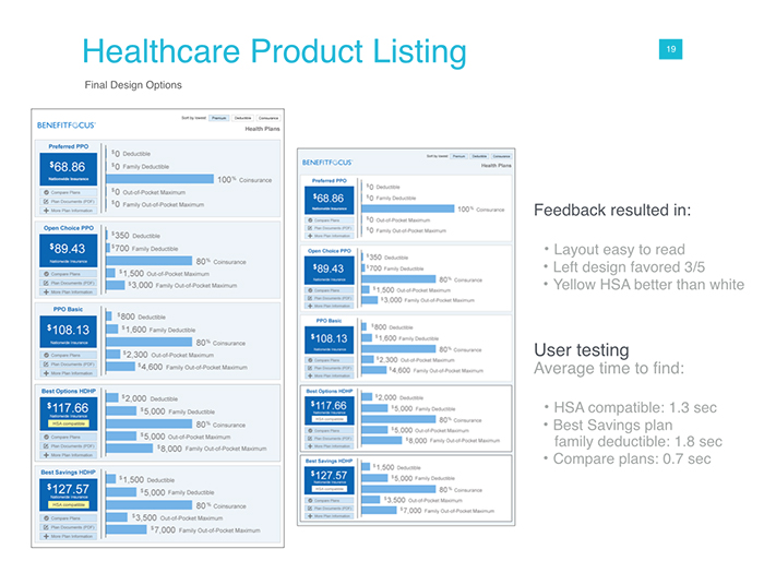
Then took the designs into final stages based on feedback.
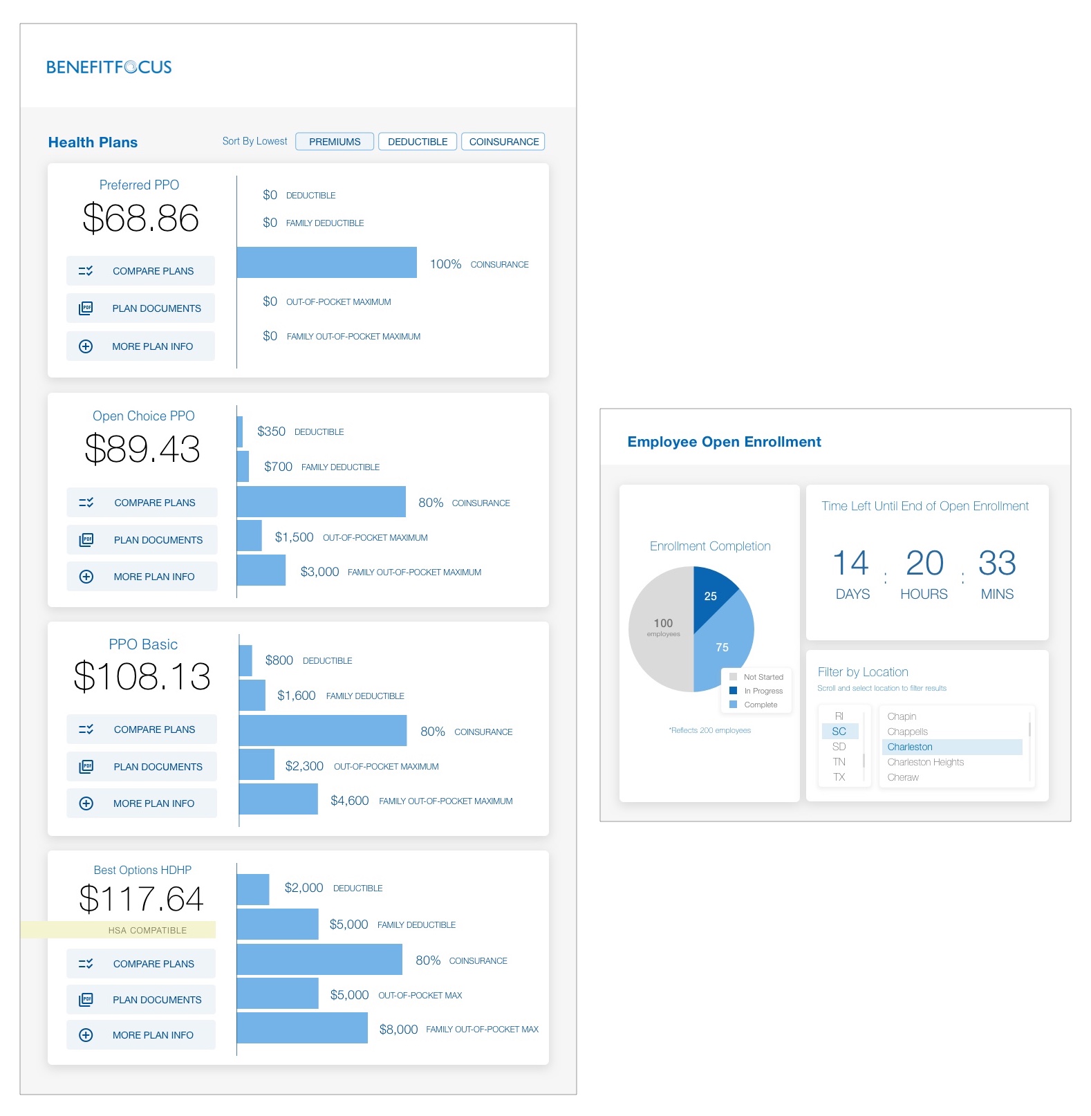
The widgets were sized for full desktop view, responsive widget sizes, and were easily navigated to via icons. The next steps were to add animations from the icons to the smaller widget sizes, so that they could easily be used from within the same screen.