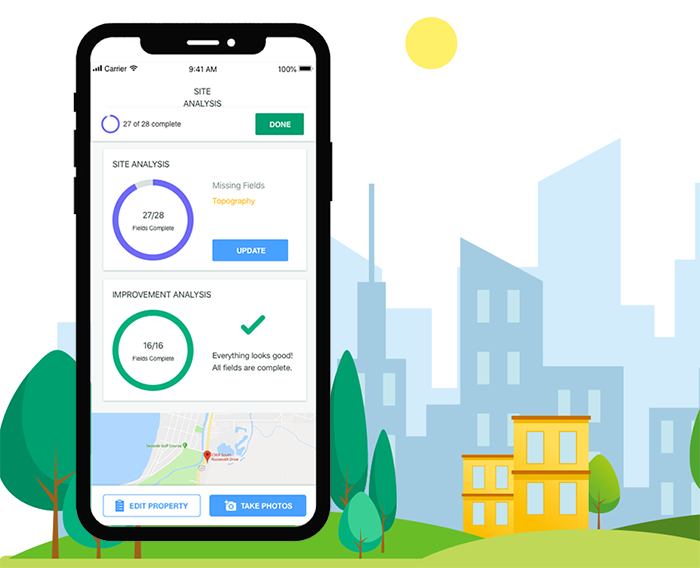
It became imperative for the people who make daily use of thumb drives to make a drastic shift in how they do their work as their employer made the transition away from the use of USB drives as a security measure. Appraisers are one of these groups that needed a major process overhaul within our corporation. It was our job to go through the discovery and automation process to provide them with a solution to make their lives easier.
Opening Challenges
Tech stack: After doing some job shadowing, we discovered that appraisers use (and buy) their own equipment, which simply means that every appraiser has a different camera and phone that they use. Most were using dated digital cameras that they plugged into their laptops, and some had very old, outdated smartphones, and that a majority of our audience was not technically inclined, which put a technical limitation on us throughout our process.
Unique user type: Because of this limitation of working with non tech saavy users with older equipment, every phone's photo system operates differently. Between that and limitations from the reporting software, this became a real challenge for us to streamline a way for the user to easily review, manually, edit, select, and move photos within the app. They also needed a way to bring these photos into the report and customize the order at which they appeared. We saw this challenge as an opportunity to streamline appraisers' processes first, and then rework the reporting generation tool.
Unique user paths: No appraiser's journey is linear. When an appraiser walks into a property, the layout tends to differ. This means that they may start out with the kitchen for Property A, the foyer for Property B, and the living room for Property C. Property managers are often busy or may need to respond to an emergency, so an appraiser's visit could get cut short, meaning that they need a way to stop and restart at a later time.
The Process
We wanted to evaluate the appraisers' current process, and did so by job shadowing and asking questions along the way. What are the most common steps that an appraiser takes during every appraisal? What are the challenges? And where can we step in to make the most impact?
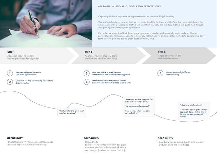
After identifying these areas and creating a user journey map, our product team and key stakeholders worked together to come up with a product roadmap that satisfied both parties, and then we were brought back into the mix.
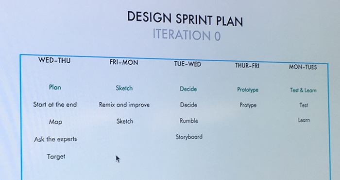
Meanwhile, our design team established a schedule to work within a design sprint in order to make our iterative process faster, and we were able to jump right in to show immediate results:
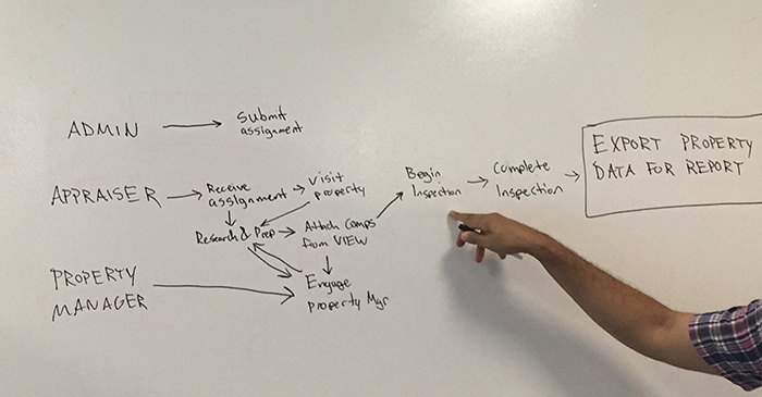
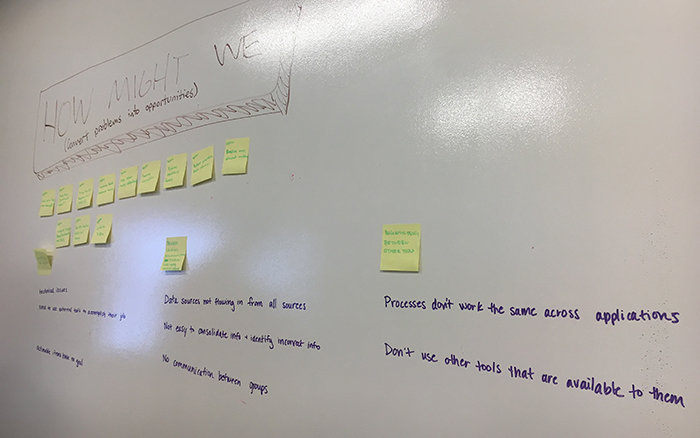
We also worked together as a team to help everyone understand all of the phases and types of user research, which helped us create the best product for our users. Once everyone was educated, we created a schedule for research that allowed us to have formal integration of testing and iterations prior to implementation.
After our design sprint, we also created a service blueprint to help us figure out how the various relationships within the application will interact.
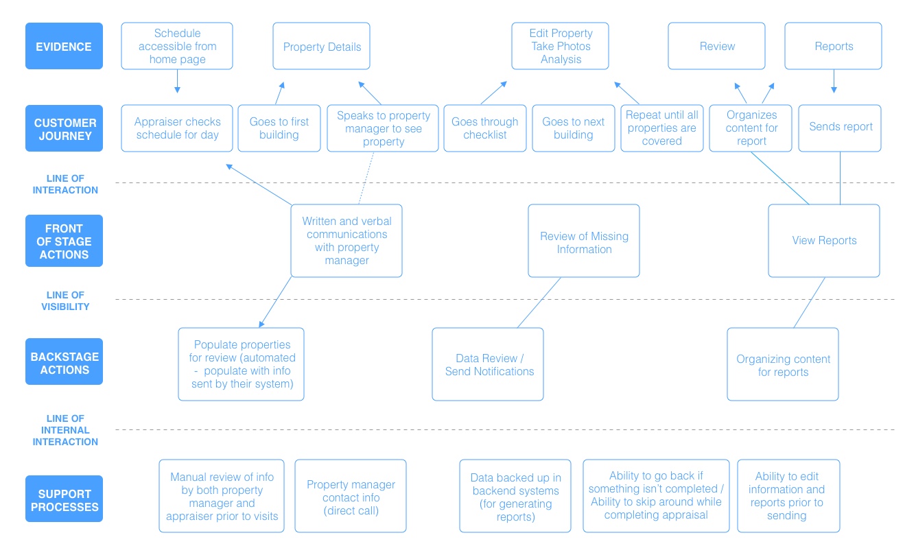
We were able to identify that a mobile app, as a one-stop shop to automate the entire process (including the report), along with outlining which phone versions our development team plans to support, was our best plan. We also used an existing design library that was built (and tweaked it slightly for our needs of the product), which helped save us a lot of time on design.
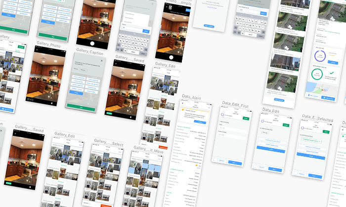
From there, we evaluated other apps to pull inspiration from, and started (what seemed like) endless sketching and refinement sessions. In Sketch, the design and user flows were updated based on weekly user feedback.
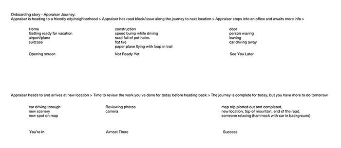
Once we had a good foundation for our app, I took full ownership of onboarding. I created a written version of the appraisers' journey to brainstorm ideas. Shown below is a refined written version as a result of countless sketches, word cloud exercises, and whiteboarding sessions.
After oodles of sketches to flush out the concept, I brought the top storyboards to life in digital format for review.
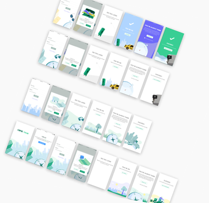
Some sections took more individual refinement after several feedback sessions. It started out with a more complex illustrative style for the branding and onboarding of the app, but became more simplistic over time.
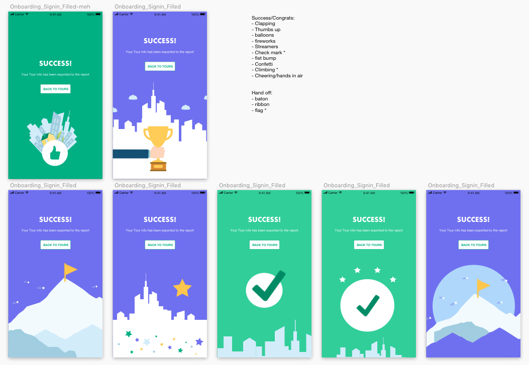
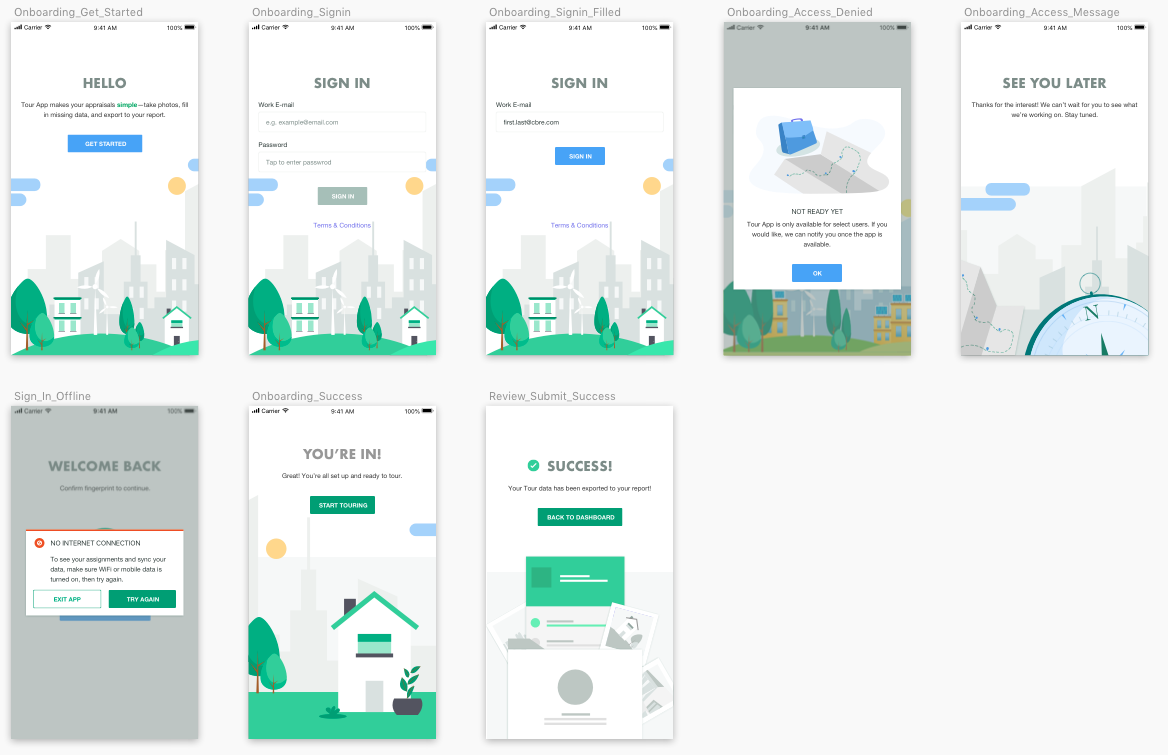
Refinements continued to be made until we settled on our final onboarding.
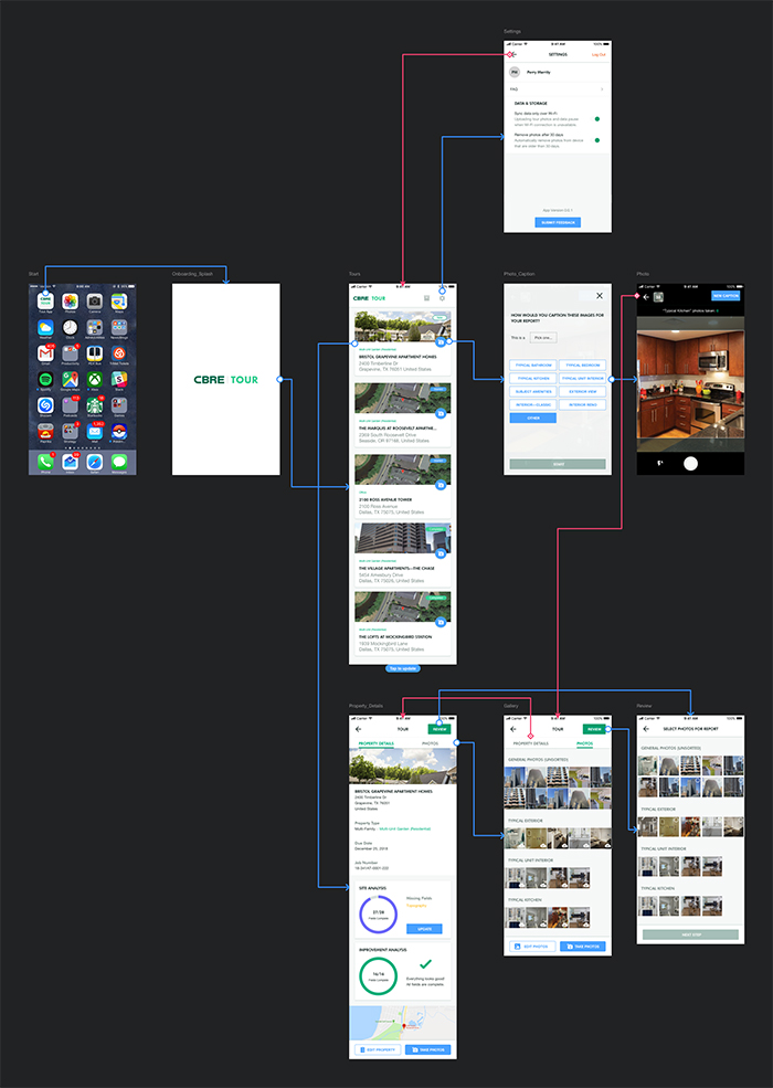
As we worked through the app, we created a visual sitemap for all flows and interactions, which helped various developers understand how it would function. While other flows were more complex, this is one example of the most basic flow for a user to take, prior to aggregating the data into the report tool.
Solution and Impact
We successfully created a brand and application from scratch. Ultimately, the app became a powerful tool once we got it into users' hands. Appraisers were successfully able to understand how to navigate through to each part of the app, go back to sections at their convenience, and generate consistent reports with ease, which were the three main objectives we hoped to achieve.
We also worked with the team to integrate the tool into a reporting system and analytics tool. The design team worked on the next phases of the product suite, which included creating a consistent report template that would allow ease of use for the users to rapidly create their own reports after their appraisals, that was fed information during each session from the back end. The team also worked on using the information from the analytics tool to create a user friendly dashboard for their managers. Overall, the Tour app saved appraisers tremendous time throughout their day (roughly 15-28 hours per work week, depending on the person).