Leading the web campaign creative direction and concepts, design strategy, and project management to launch the new TechControl feature on the Golf A Model series and highlight its benefit to users, while aligning the rest of the John Deere Golf website to direct users to the campaign. Our team coordinated with marketing, copywriters, designers, external video editors, and developers to create an interactive responsive website to market the product's ease of use.
Challenges
1. Technical constraints: Working in a corporate environment, we had several constraints within our guidelines, backend system, and we had an outside agency translating the desktop website into mobile. Since it was translated, we lost the design aspect, since only the content was transferred and displayed. Considering that most users at this time were primarily using desktop, it made the most sense to the business. However, our target user, a golf superintendent, is always on the go, and was less likely to be at the office behind a desktop screen. Based on what we knew about the persona, they are typically spending a majority of their time on the golf greens, so if we wanted to tailor this to our target market, we would need something that was better adapted for mobile.
2. Target audience values time: We also learned that our target audience currently spends a lot of time training employees how to use the equipment and often struggle with consistency of cut, which is very important on a golf course, so displaying the benefits of this product is crucial for saving them time and money. Tehy also want to save time by spending as little as possible looking for the right product to suit their needs, and the time crunch was a new need for us to solve We knew we needed to change the way we displayed content to reach this audience.
3. Business constraints: Our team had a lot of pressure from the business to stick within the given templates, so these constraints were quite a challenge to work around, considering that this was our first mobile-first product, and we needed an out of the box solution.
Process
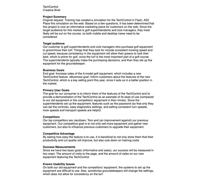
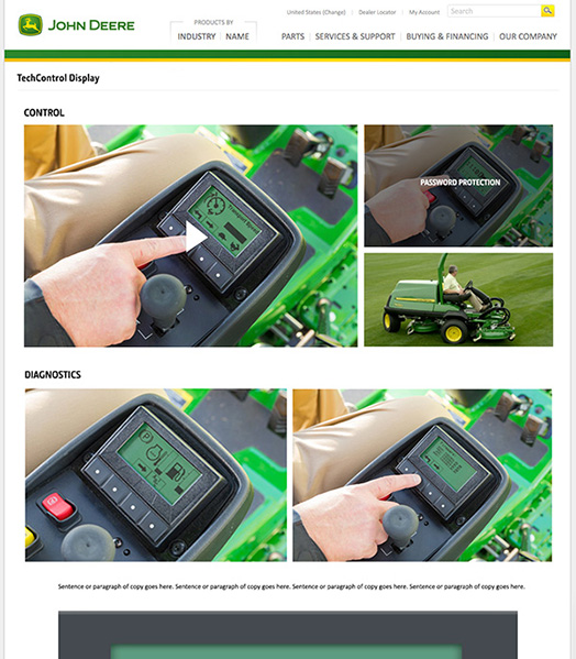
When I was first informed about the project, it originally was a clunky animation for training purposes that the business wanted to put onto the web. We knew, based on how the file was created, that we would need to redo the animation, so we dug deeper to understand what the needs are and how we could create something more fitting for users. After asking more questions, we determined that the piece should be used for marketing purposes.
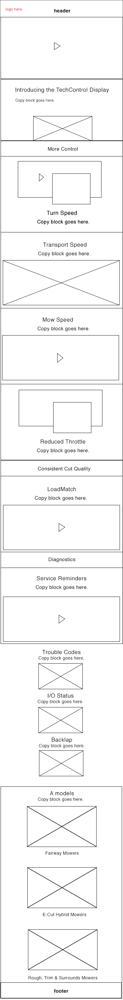
Since we had a limited number or components and templates to work from, and had to stick to these constraints, I got started on sketches and quick concepts with how we might best lay out the information/
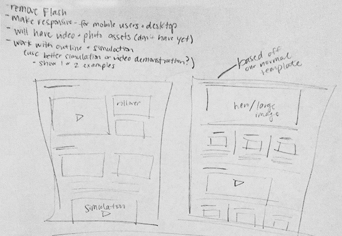
Based on the constraints we had from the out of the box page templates and elements that were available, this was the first round of concepts.
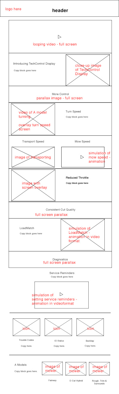
We turned the sketches and both wireframes into mockups.
At the same time, we had to figure out how to override the agency's translation to display the design we wanted on mobile. During that process, the layout also changed based on what we learned along the way.
We needed to stay within the template, but at the same time were working on a responsive website, which had never been done before within the enterprise. We needed extra resources to help us figure this out from a development perspective, and we also didn't know if the business side would have an issue with it, so we had a backup page ready from the template that would have the content translated.
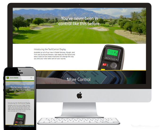
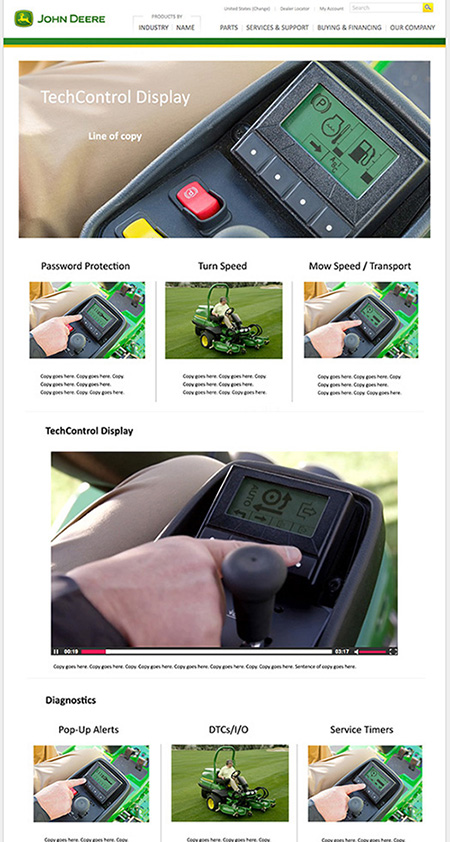
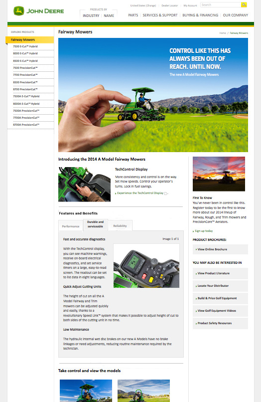
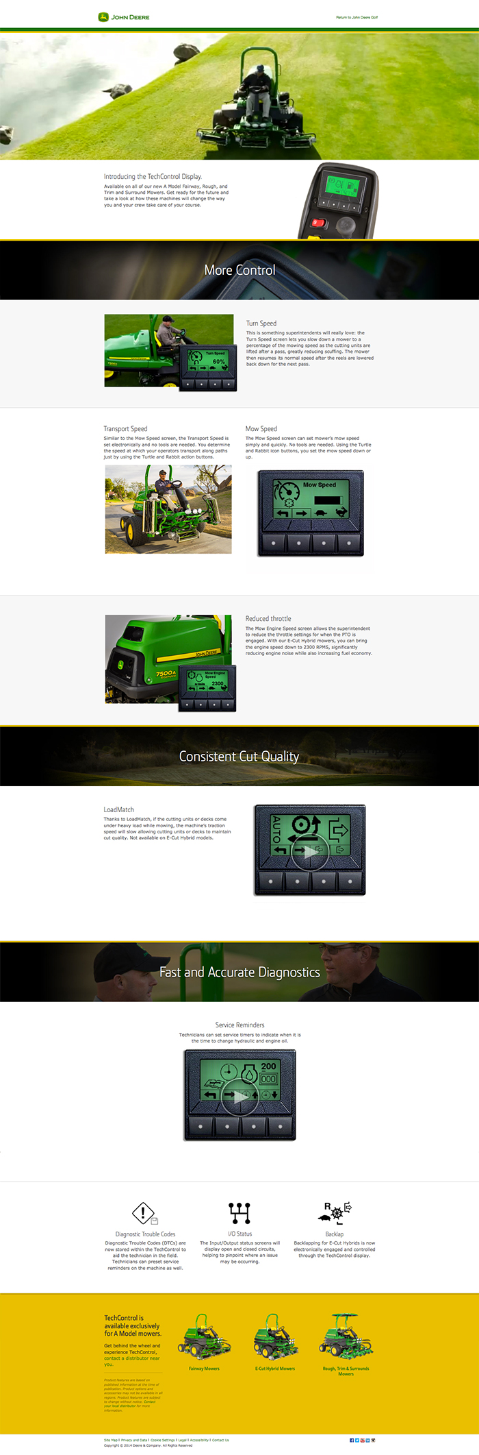
What we ended up with, to have the best compromise between user and business needs, was to use the template page to highlight all of the main content, but have a link to the responsive website to dig deeper. The page included a lot of animations to demonstrate usage and paralax scrolling to make the page appear more dynamic. Since we were breaking ground by establishing the first responsive website, we still needed to stick to the branding guidelines, to give the page a consistent Deere look and feel. We put the features and benefits into easily digestible tabs, and showed quick snippets below with short animations/videos for easier scanability.
As the layout and content changed, we updated wireframes to help guide our work with the development team, and then we delivered our new direction to the agency that was translating the website to mobile, as well as the updated content from our copywriting team. At the same time, the design team was working with our photo/video team on content for animations, and I was meeting with the team regularly on content direction and strategy.
Since the needs shifted from our typical desktop first, to now mobile first, creating a responsive website as a link from the main template appeased the business needs, and the users were excited to see a more dynamic page of information.
For the final page, since it was responsive, mobile, tablet and desktop versions looked very similar, but simply had different break points. We were able to override the agency's page translation work, and the mobile site had the same elements as the version shown above, only instead of placing elements side by side, they were stacked vertically. This was our final campaign page:
Solution and Impact
Since we paved the way for responsive design websites within the enterprise, it was well received across the organization, to the point that other product teams started approaching us to build similar pages for their products.
From an analytics perspective, the golf page (that pointed users to this new website) had one of the highest YoY traffic compared to other pages across the company website, as the new responsive page was highly trafficked. When speaking with dealers, they had a lot of people asking about the product and were selling the new equipment more rapidly than anticipated.