An overhaul of the current enterprise leadership development portal to create a better user experience. Our users encompassed employees, and all levels were involved in user research, from intern to SVP level.
Challenges
During the course of the project, I did a lot of user research to understand the best information architecture structure, as the current portal was confusing for most users. At the same time, the business was trying to figure out which back-end system to use, which became tricky for us to design for, as the needs continuously changed. We also had a lot of constraints from the business client to work through.
Process
Our team started by evaluating the current system, conducting surveys, user interviews, and a heuristic evaluation.
The next stages were to assess that feedback, and make UX improvements from there. Below is a map of the user journey throughout user research of the current system, plotting out points of failure during tasks against the user's mood during the process.
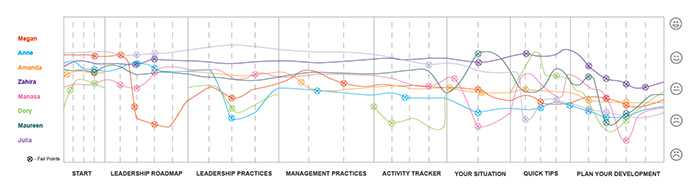
The current system was so unfriendly for employees to use, that we had one frustrated participant quit in the middle of the moderated session and said, "Good luck!" Other participants skipped sections entirely or failed at several tasks because items were so difficult to navigate and find, which told us that information architecture should be the first thing to tackle.
Due to the fact that I had led several user interviews, I was able to leverage existing templates that I already created, which made it easy to rapidly test the current system.
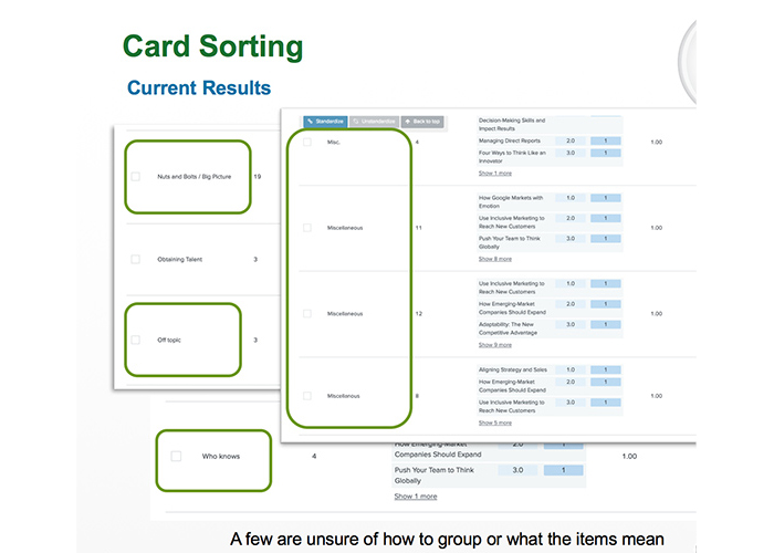
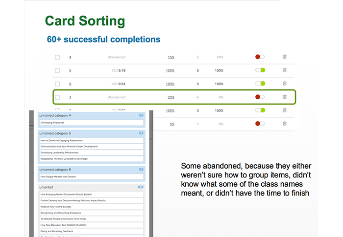
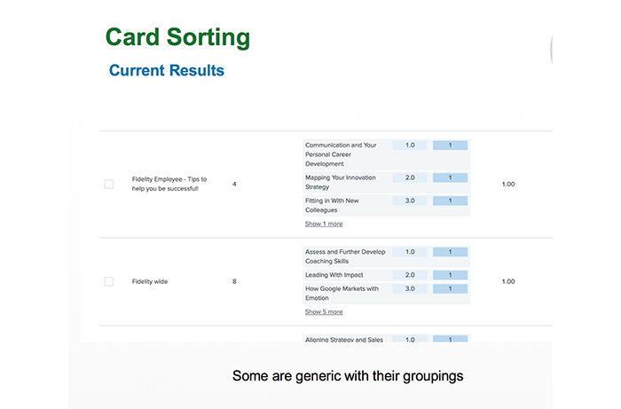
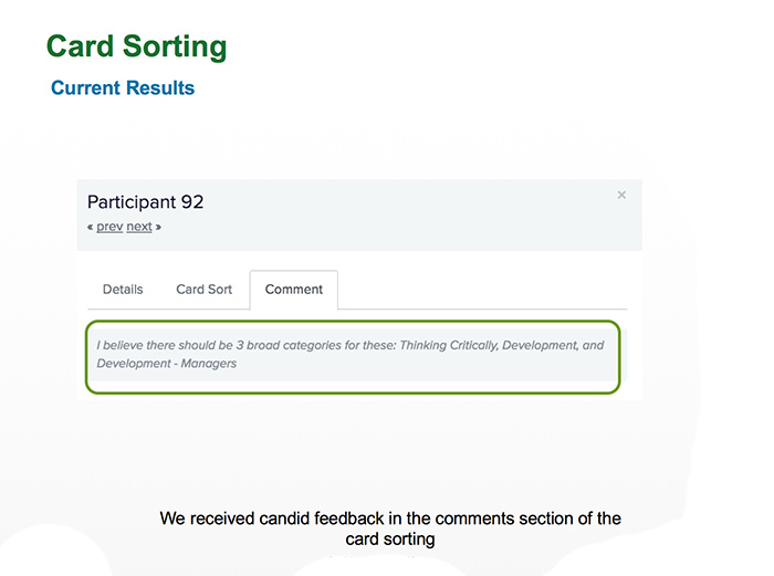
After evaluating the current content, and eliminating duplicate information, we used the content to reach out to users during a card sorting exercise to help us group the information in a way that made sense to them.
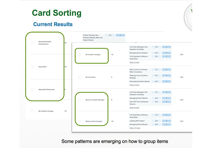
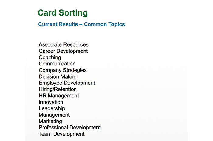
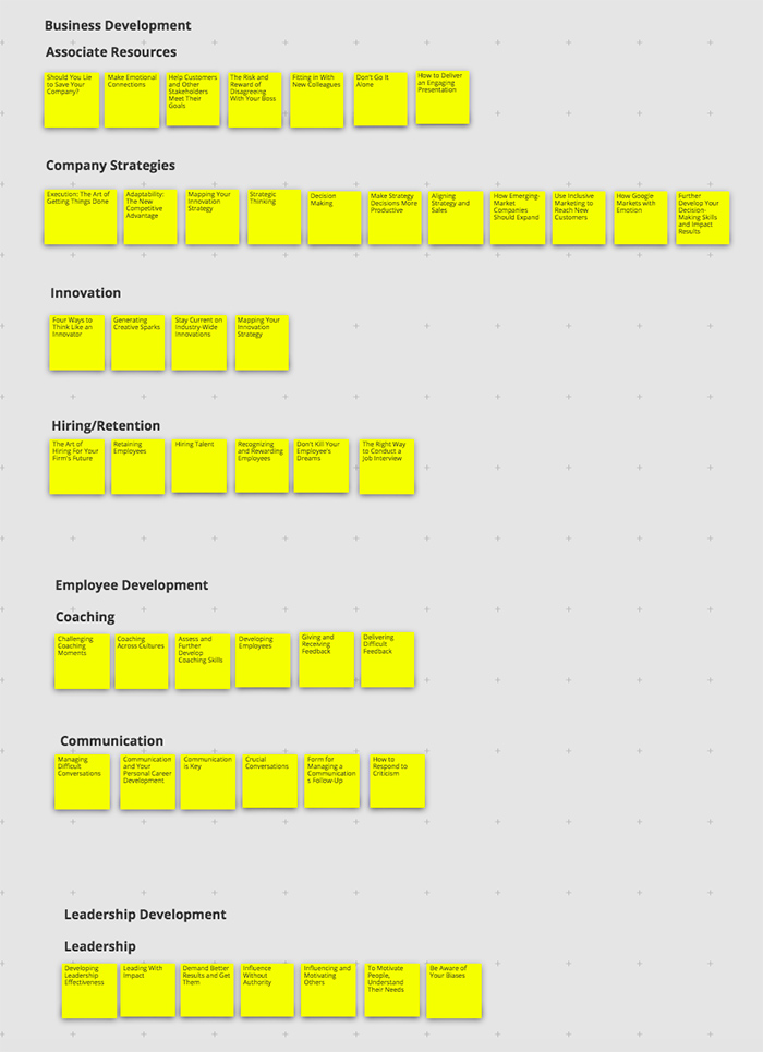

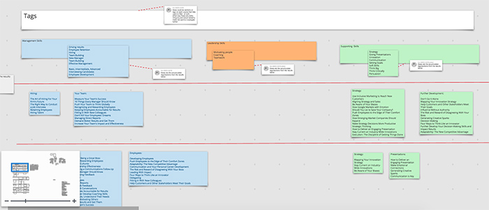
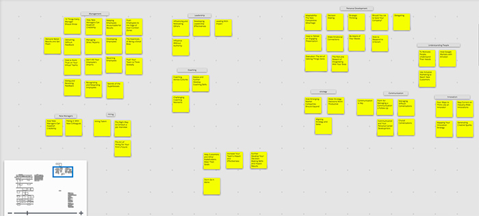
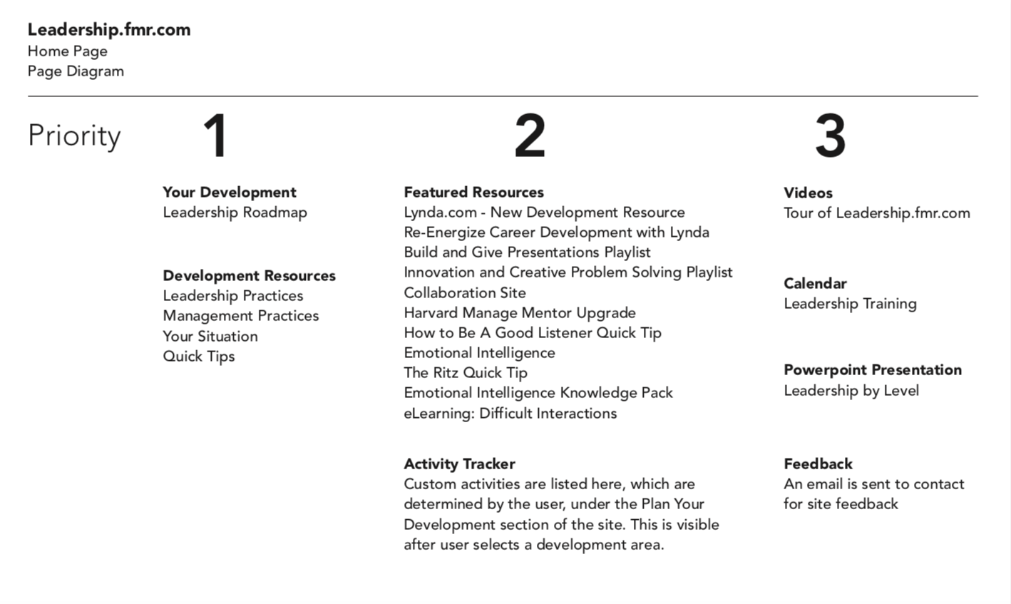
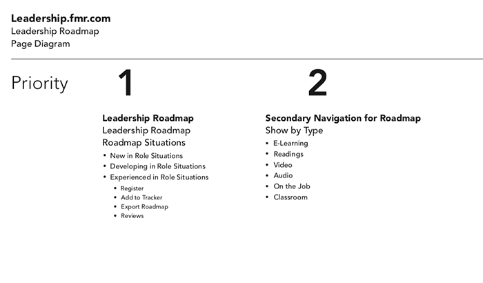
We went through journey mapping, page diagrams and card sorting to enhance the system's navigation system and information architecture.
The main findings from user research were that the users enjoyed the color coding to lead them throughout various segments of the system, but they found difficulty in understanding the language (both in navigation and in the page), the navigation did not make sense to users and did not use clear names that made sense to all, and that users had difficulty finding information.
Throughout the project, the business requirements changed from both a stakeholder and a technology perspective, which threw the design for a curveball, as you might see throughout the process. Despite several changes, in the end, we were unable to alter the bottom portion of the portal for user needs, and had to use the current enterprise learning portal as is.
We were still able to restructure the content so that each section has its own relevant information, maintain an identity for each section, while achieving the other user goals.
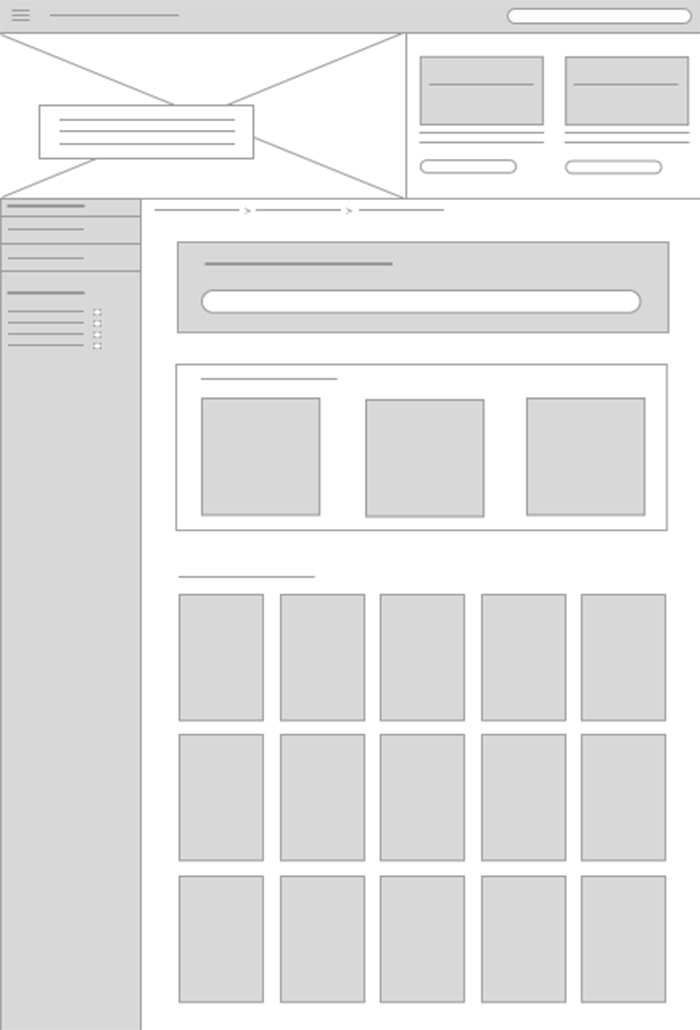
We then went into sketching and wireframing phases, and ensured that the wireframes would be shown in a manner that the business client and development team would notice that it is not the final design.
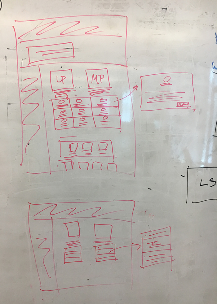
At the same time, we were also establishing the sitemap, so that we knew how users would navigate through the portal.
As we transitioned into a new system within the enterprise on the back end, I studied how different pieces might be best to utilize for the portal, and how the portal would fit into the templates, so I broke down the main elements that would be useful, and turned them into simple components for our team, since they didn't have a design system in place.
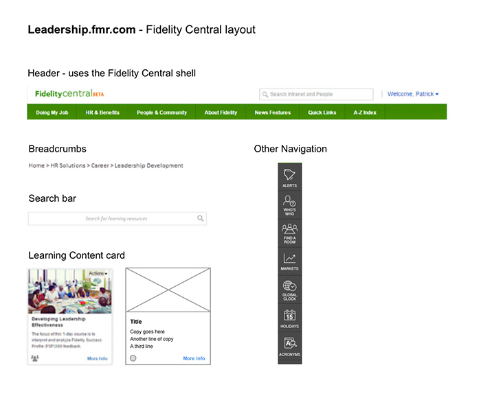
From there, the first phases of mockups within the Fidelity Central portal were born, from Lo-Fi to Hi-Fi.
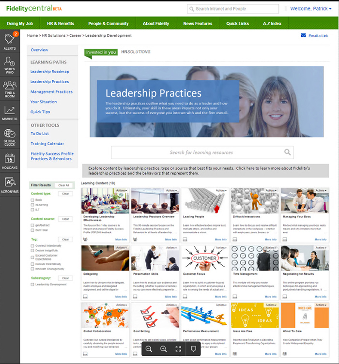
Unfortunately, due to the state of the system, we were unable to control the navigation to get to the learning portal, but we could control how users navigate once they arrived there.
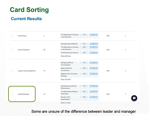
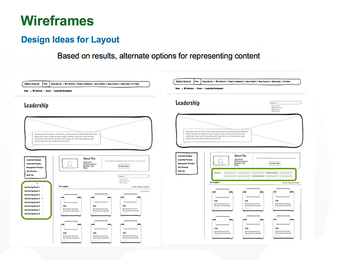
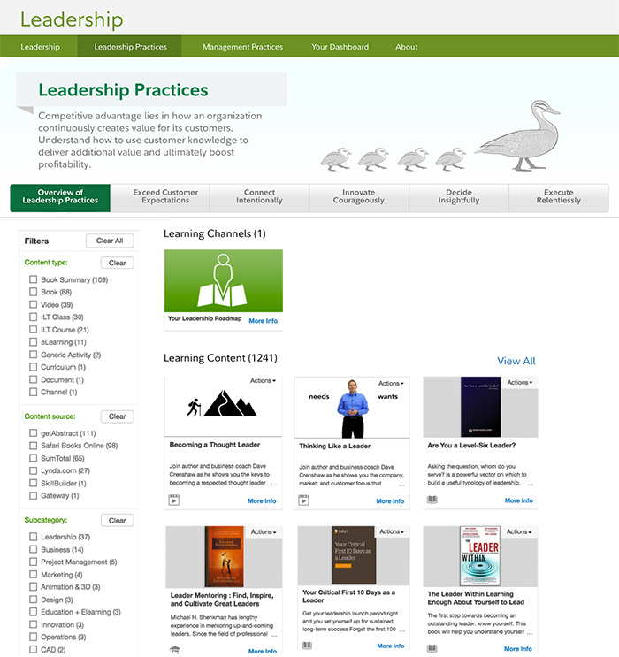
After another round of user testing, we discovered that users did not understand the difference between leadership and management so they felt that the portal was for senior management only, so we did more investigation on how to portray the difference between "leadership practices" and "management practices," since it was a business requirement to keep them in place. But we wanted users to know which area they needed to enter to get the right information.
We tried to achieve this by adding information and putting it front and center, but users glanced over it, which brings us to our next round, where we placed more information at the top regarding both sections.
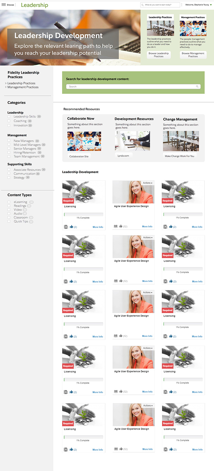
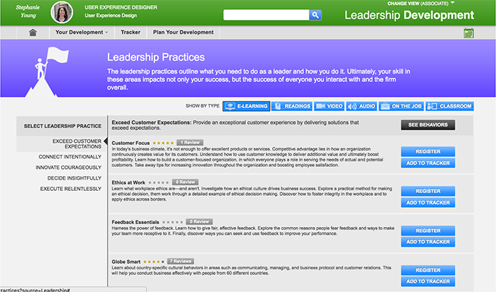
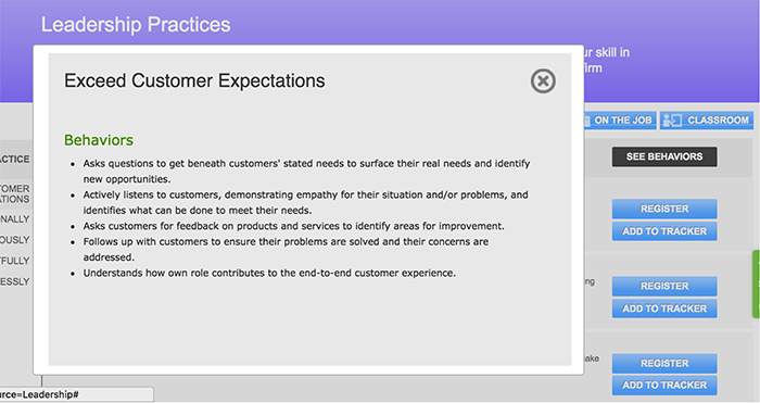
We learned during this iteration, that users wanted a quick way to access the learning that was assigned to them, and they had difficulty grasping the terms within each practice type, which was a requirement from the business client to maintain. Since we were unable to change the names/wording on the navigational elements, we expanded them, allowing users to view explanations.
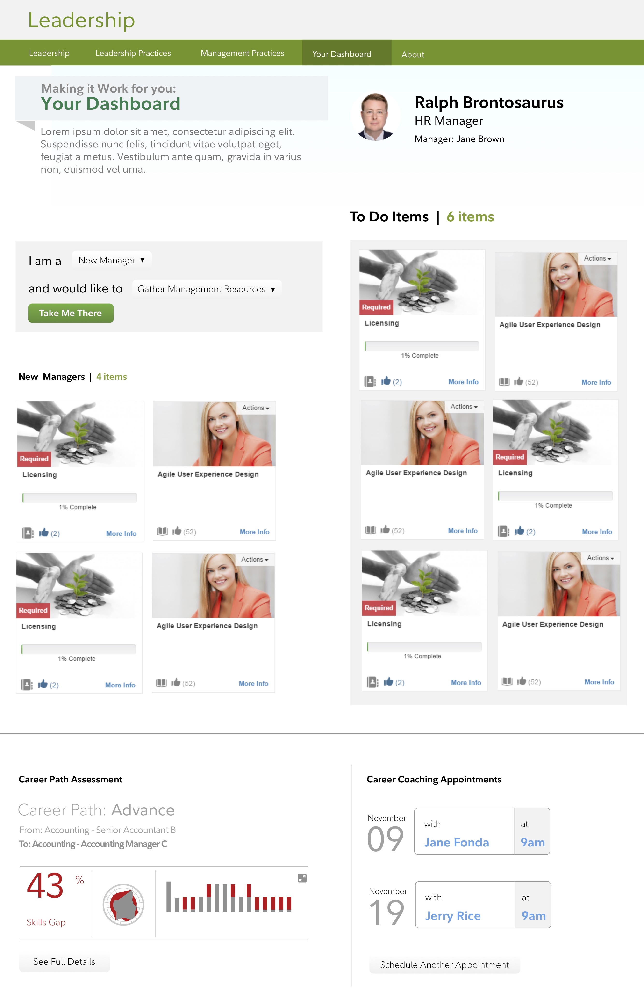
We also tested placing icons with the descriptions at the top, as well as a solution that focused on career path.
The feedback from these sessions got us a lot closer to the final designs. The icons were well received, as were the descriptions. However, we needed to maintain a better secondary navigation for users. The catefories and content types weren't as well received, but remained a requirement from the business client, despite what was best for users. For the MVP, these were brought over from the learning system, so this was not a priority to update at the time.
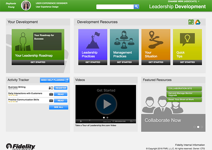
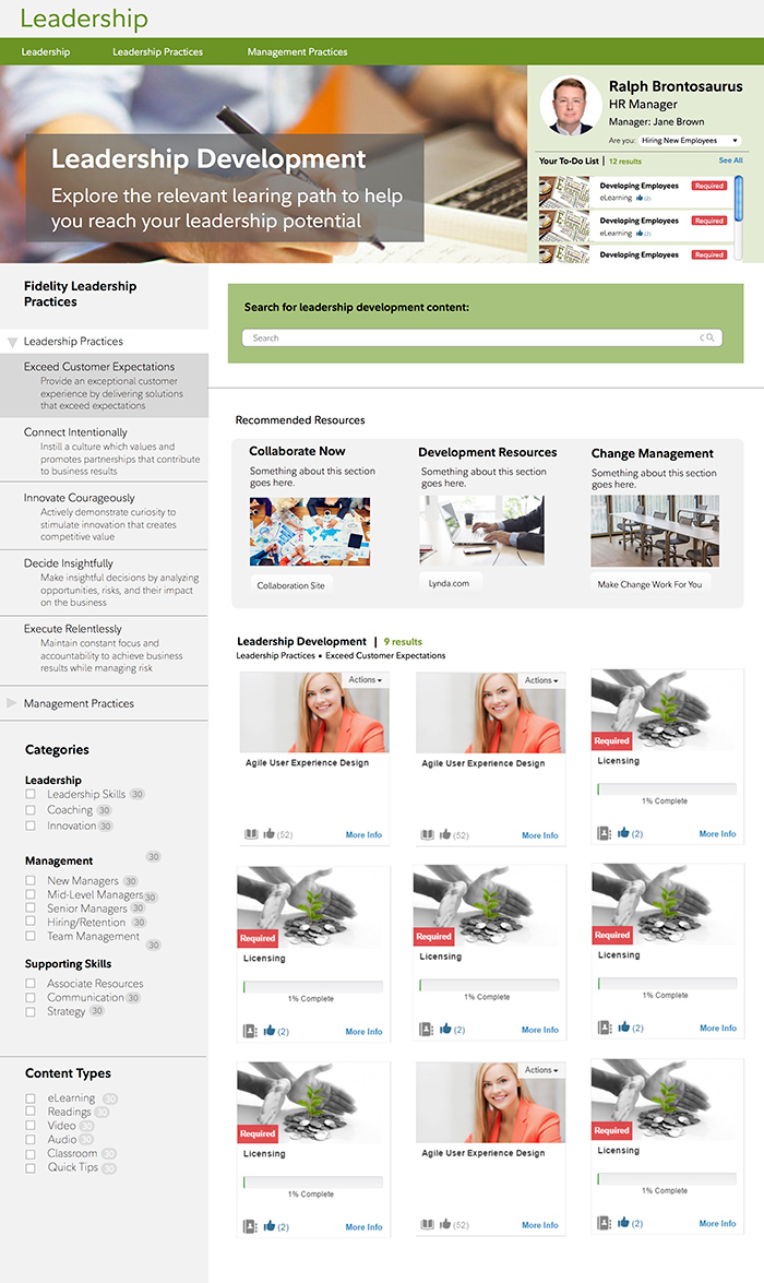
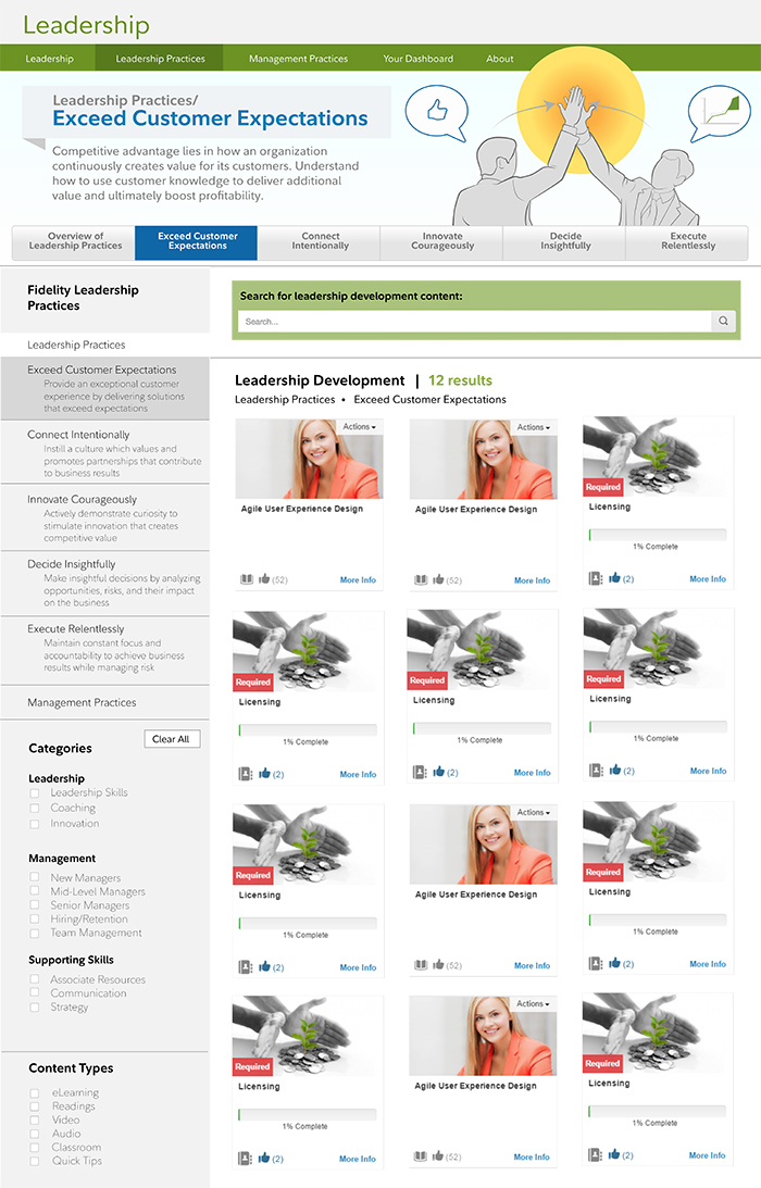
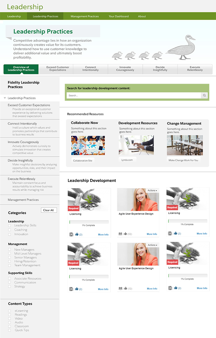
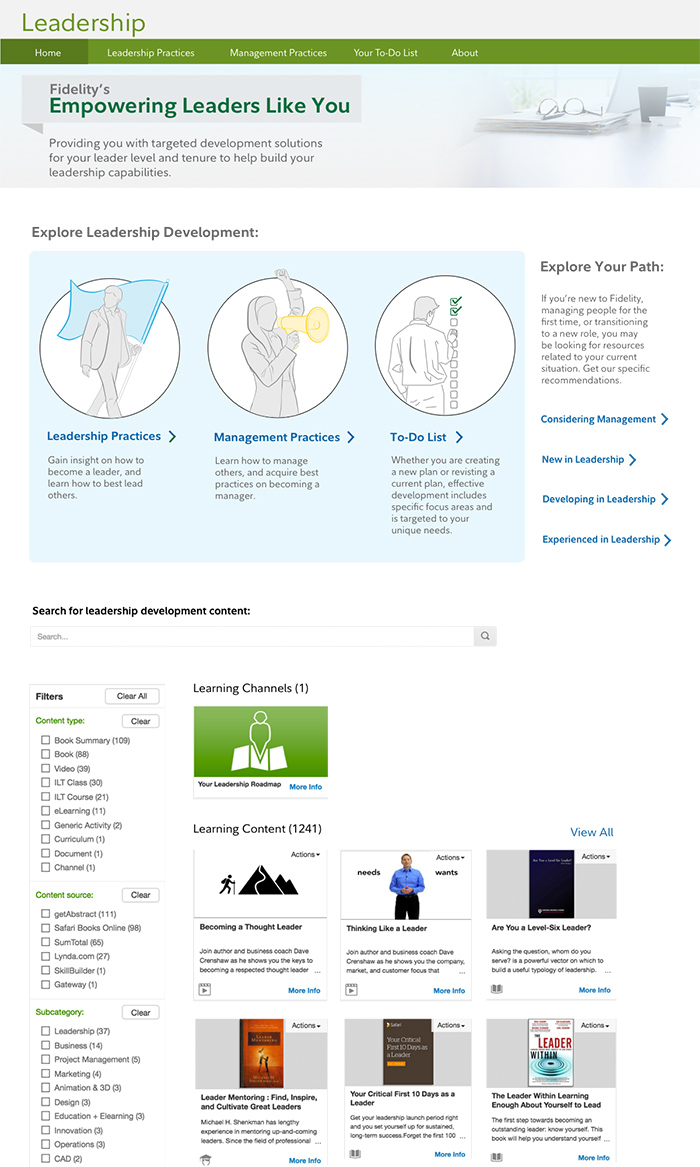
During this round, we turned the icons into more demonstrative illustrations, so that users who wanted to scan the page could better tell what the section was about. For those who had more time to read or wanted more information, there would be more information at the top for each section. Based on the feedback, we also added a secondary navigation, in which content was provided from an overview level in the left-hand navigation (so that users could understand what they were selecting), as well as additional details at the top after users selected that section. We also wanted to test out a "Recommended Resources" section to see how users responded to those highlights.
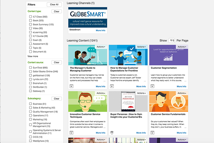
While these designs were being tested, the back end structure changed another time, as we decided to implement a different learning portal. As this change was being made, this would change how we did the secondary navigation, as well as how the content would be displayed, filtered, and searched.
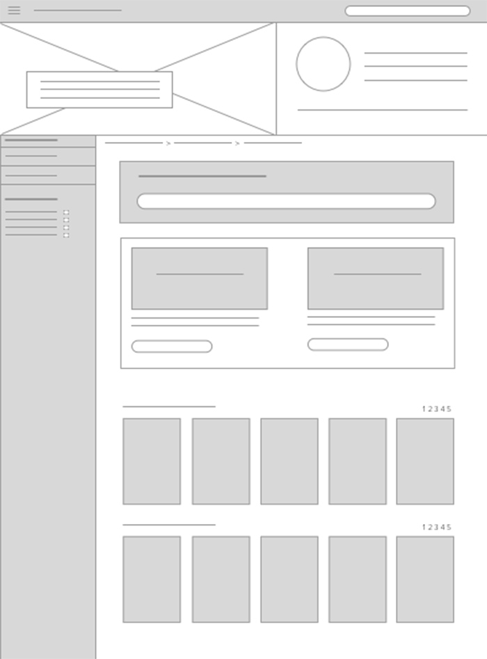
As you can see, we had to get rid of the secondary navigation that allowed the overview descriptions in the left-hand side. The system also didn't allow for users to search within each page, so we had quite a few new constraints to work with.
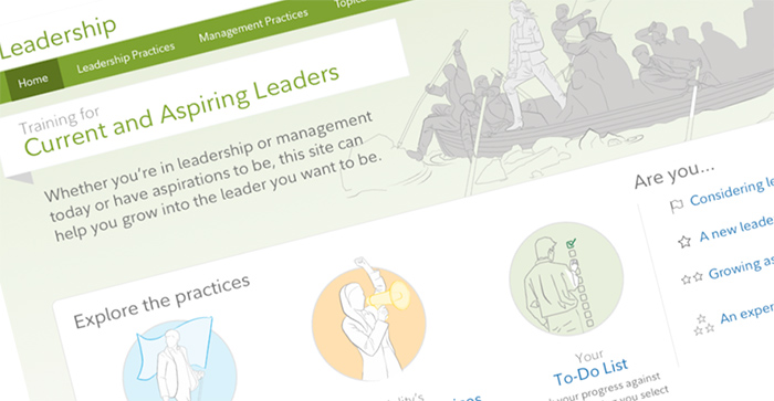
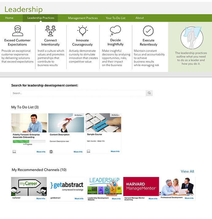
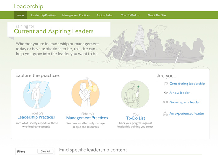
Given the new constraints, we focused on the home page, and guiding users to the right sections from there. Based on the prior research, we knew that users needed to know the difference between "Leadership Practices" and "Management Practices," knowing which section they were in once they chose one of those paths, as well as having an easy way to access tasks that they need to complete. Because we had also heard from users that they felt intimidated using the portal, we also added a section that made the portal appear open and friendly to all levels. We also did some work with users to group this content into these segments, as well as their assistance in gathering the proper copy to frame that context.
The final round transformed into something similar, but the visuals were a consistent illustrative style. We also changed the title on the search below and added better user-friendly headlines above each segment.
Solution and Impact
Both the business client and users were pleased with the rollout of the new learning portal. We gained significantly more traffic to the portal, and the CEO of the company started using it regularly as well, which was a big win for our team. This project allowed the UX team to gain traction and recognition across the business for internal tools.
After this project, our design team created a design system incorporating these reusable patterns, which was then utilized for a new career portal. Because the patterns were already established, the career portal was much faster to create.
After the completion of the career portal, I worked on projects focused on information architecture in re-structuring internal search systems, developing a help chatbot, and designing a system for managers to order and track equipment for onboarding new employees.