Design updates to the application for a comprehensive snapshot of someone’s health, as a personal health record, using atomic design principles to achieve a cohesive design faster. Users will access a link to the app through their company's healthcare portal, and can easily stay informed with their medical updates. I used Sketch and InVision to achieve rapid prototypes for user testing. In this user scenario, the first-time user is on the path to hypertension, but is currently in the prehypertension stage.
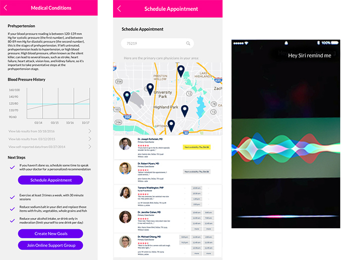
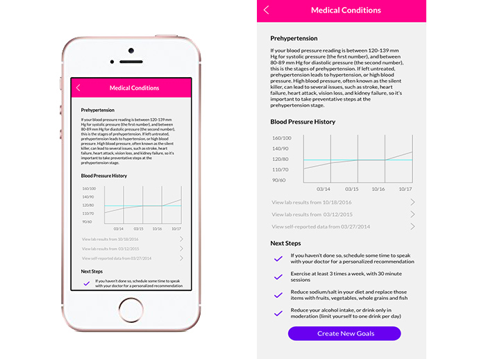
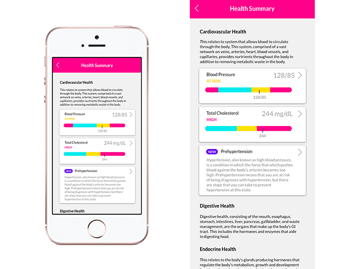
Below is an example of the Prehypertension Details page from the Health Summary section of the app.
Opening Challenges
Deliicate details: Since the app is targeted to corporate users, using the app, an employee may discover a medical condition for the first time after a blood exam. It could be difficult to appropriately deliver this delicate information, while also driving the users in the right direction to gather for more information and to develop a plan of action to manage their health.
The Process
We started off by evaluating the app at its current state, and identifying user pain points. This was the current state of the app when the project started.
During this evaluation, we did a heuristic evaluation, and then identified user flow paths for the current state of the app.
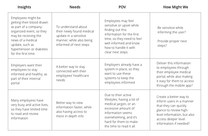
We also evaluated the user needs and business goals that turned into How Might We statements, to help us stay on track while creating a solution.
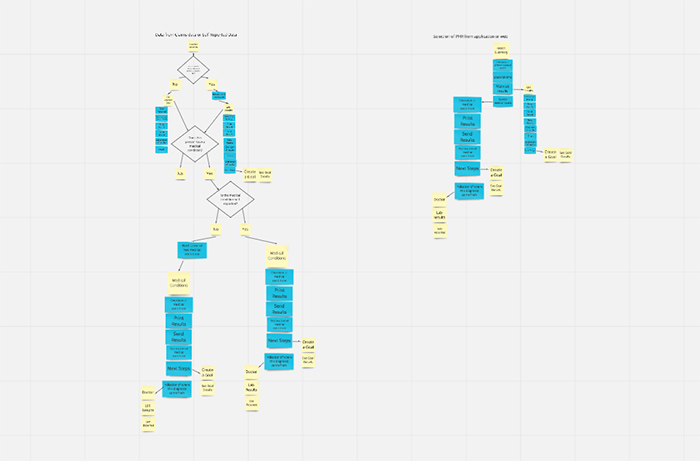
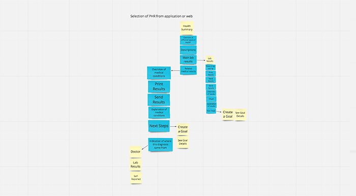
We also performed usability testing of the current application, to help us with current evaluation and assess where the gaps are. This helped us identify where we needed to go, while strategizing for the application refresh. Using all of the analysis results (heuristic evaluations, speaking with users, viewpoint and HMW analysis, and user testing), updated user flows were created after understanding our users. This was the user flow for first-time users of the app:
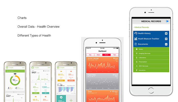
During this time, market research and inspiration was also gathered to help us evaluate where we need to be while updating the UI.
To get a better idea of current user pain points, and to help us discern how our product could grow in the future, during more in-depth user research, we interviewed 16 participants in 4 quadrants: health active, healthy inactive, diabetes managed, and diabetes unmanaged. At first, we were focused on a diabetes track use case, but after the user research was completed, the focus shifted for the designs to hypertensive use cases. We worked directly with the development team weekly to develop a new section of the atomic design library, to ensure speed and accuracy on implementation of new designs.
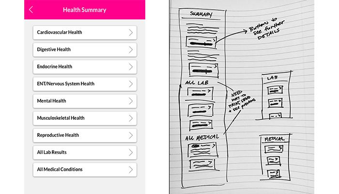
Below is the first iteration of the app, along with sketches, to get some basic ideas across.
What we learned during the research, after affinity mapping assessments, is that users wanted to get to the information faster, as well as the most important information upfront:
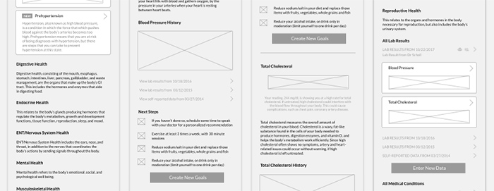
From there, wireframes were created.
Solution and Impact
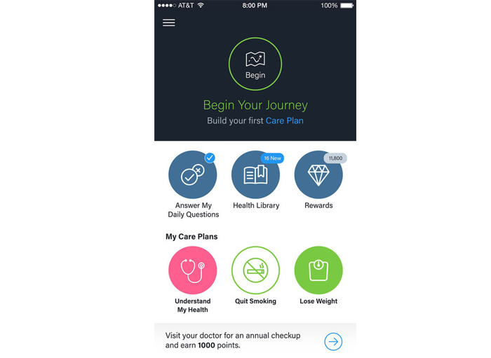
After several iterations of brainstorming and wireframes, the design started to come together. We needed a design that was not only attractive, but also user friendly and accessible. This is where the visual hierarchy and colors from our design library came into play. Here's how the sections of the Health Summary/Health Library came together.

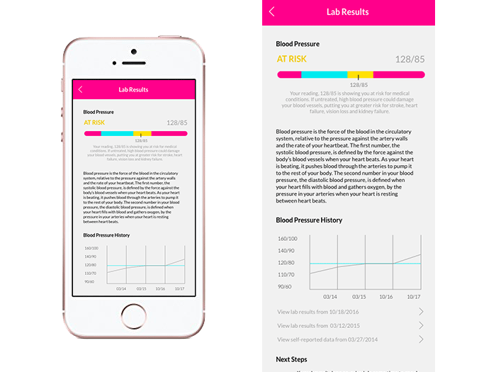
For a user to navigate to these sections, he or she might receive a new health notification after the lab results have been imported. Here's what an example that a user might take from this type of notification:
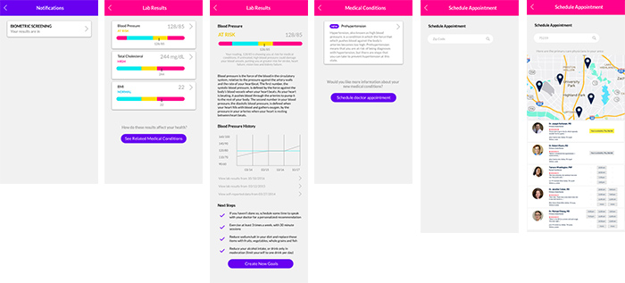
The user receives notification of biometric screening >> User is taken to Lab Results page >> User selects a lab result (in this case, Blood Pressure) >> User is at risk for Hypertension and scrolls through lab results details >> User learns more about Prehypertension >> User sees suggested path to take to get his or her health on track >> User clicks on Schedule Appointment >> User is able to choose through various doctors that are in network and schedules appointment.
Future of the App
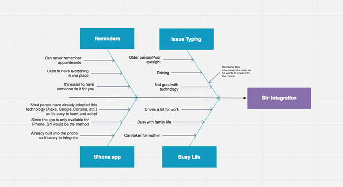
During our user research and moderated sessions, we gathered valuable input from real users. This information helped us not only bring the app in a positive direction for users, but it also helped us gather ideas for the app's upcoming version releases. To give you a little more perspective on the strategy behind just one idea for the next stages of the app (in this case, voice integration), here's a fishbone diagram that was used to capture some ideas for the next stages of the app that allowed us to determine user-friendly features to plot along the product roadmap.
Using what we learned based on user research and feedback sessions, we worked with the product team to determine the product direction for those next product releases of the app: