In a corporate office building with open seating, employees need a way to book a desk based on their work style during specific periods of time -- individual desks for quiet time, clustered desks for collaboration, and meeting rooms for personal group conversations.
Opening Challenges
Here's what I walked into...
1. Deadline Nightmare:
Before I entered the project as a sole designer, a primary customer/stakeholder decided to use a third-party app in the interim due to prolonged delivery for over a year past the initial deadline, in which they felt unhappy with.
2. Merging New and Existing Platforms:
We also had clients using the current app, in addition to the client using the third party app. My role was to learn and understand current users as quickly as possible to deliver strategy converting all clients (new and existing) onto a new platform that was best suited for the users' growing needs in addition to rebranding the app.
3. Growing Needs:
At the same time, we were also gaining traction on a growing client list for the rollout of upcoming features. As a sole designer, I was spread thin, and needed to hire, build, and grow out the team while staying on track to deliver.
4. Massive Technical Changes:
Our tech stack changed throughout the project, as the engineering team evaluated Angular vs. React. In the middle of building out the updated app, our team had to rebuild the back end while the team was in progress of updating flows (after iterating on prototypes), which exposed us to version control issues.
5. New Technologies:
The project relied heavily on new technology in the IoT space, which was new to the company. We installed sensors throughout client buildings to allow us to know when rooms and desks were being occupied, which created technical issues between the back end and front end of the app.
6. Mistrust Bias:
Prior to entering the project, designers had a very high turnover rate, resulting in the team having massive burnout from having to adapt quickly to new designers or externally contracted teams, and assumed that anyone joining the team would not last.
Coming on board, I helped the team take their mindset from endless challenges to face to
embrace opportunities:
• Collaborate more effectively as a team on delivery through process improvement journey maps
• Build trust with stakeholders with confident, data-driven decisions toward solutions
• Gain confidence from our executive partners by making wiser decisions through KPI metrics and user testing as we launched the product with a new international client in an unbiased atmosphere
• View designers as a long-term investment, with a high potential to solidify and expand the team
• Positively rebrand the app to gain a larger pool of users (and clients)
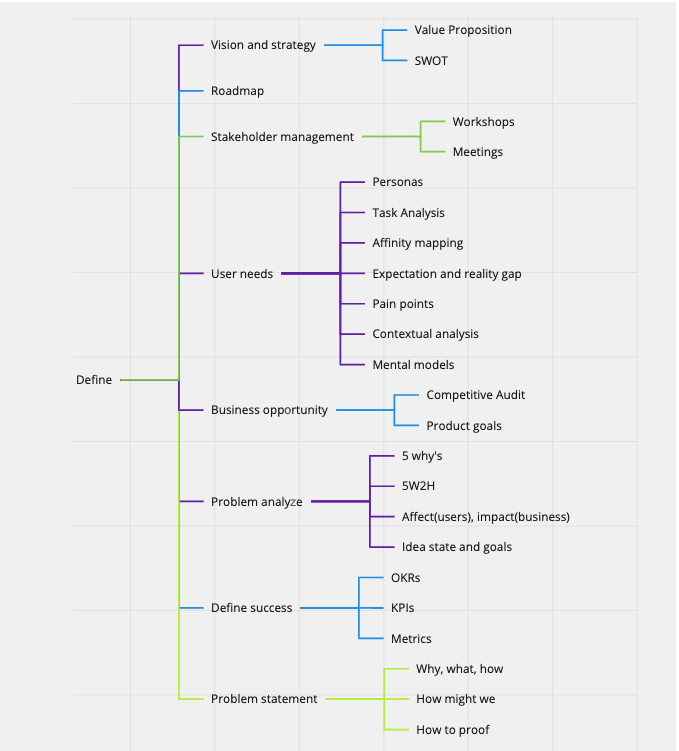
The Process
User Testing and Journey Mapping
Before adding new features to the existing product, we needed to gather an understanding of the current experience.
The team aligned on current workflows, usability issues, and UX research experienced at Nike, one of our existing pilot clients.
In Amsterdam, our client was launching their new smart building, where we were able to test their interim third-party app in real time with users during their smart building launch. We used this opportunity to evaluate how this interim solution was performing in real time during chaos with peak user performance, pinpointing the unique challenges users were facing. Some of these users also used our current app in another client building, while other users were a clean slate to test with, making for a solid blend of users to learn from.
I worked 1:1 with users in real time, during several rounds of user research to understand their user journeys, pain points and challenges, styles of working, needs, and unique edge cases
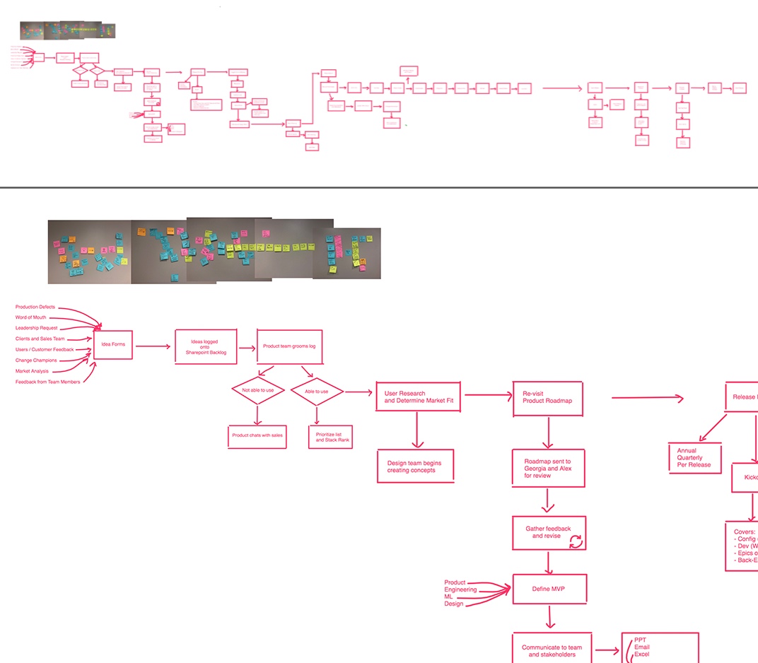
and worked with stakeholders to whiteboard a rough draft written journey:
We were allotted 5 days in Amsterdam and made the most of our time with users and stakeholders. After shadowing users, gathering feedback, and conducting interviews, we created a small group workshop prior to closing. We grouped and evaluated all of the current issues and discussed impact, conducted stakeholder group sessions (with real-time user feedback) to evaluate potential solutions, assessed limitation possibilities for risk management, and curated a roadmap evaluation session.
This process took several rounds and a heavily-involved collaborative effort with the product team in Europe, the client, and various users of the application to whiteboard. We went deep into the discovery phase to properly assess solutions that would be presented to our global leadership, backed by what we saw, heard, and evaluated during several rounds of affinity mapping against system performance metrics.
The teams continued to collaborate and brainstorm. We also facilitated a team retrospective prior to our in-person separation to pin key takeaways on what we can do differently as a team working together for the upcoming iterations as we moved into remote work across a 7-hour time zone difference.
Team Expansion
As the UX team grew, we needed to create a structure for future user research, as well as build a ResearchOps program, which I led.
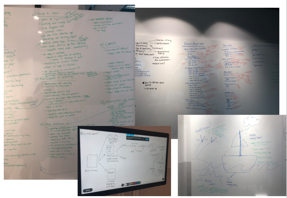
In addition to adjusting to a new way of working, hiring and onboarding team members, and expanding our product, we needed to update our processes to reflect how the team works best collectively to grow this startup project into a smoother sailing ship. As leadship gathered into a room, I led a process improvement workshop, where we navigated our current processes from start to finish, identified where issues occur, and created a new process to follow, with steps to continue iterating based on team expansion, learning when and how to pivot to benefit the team.
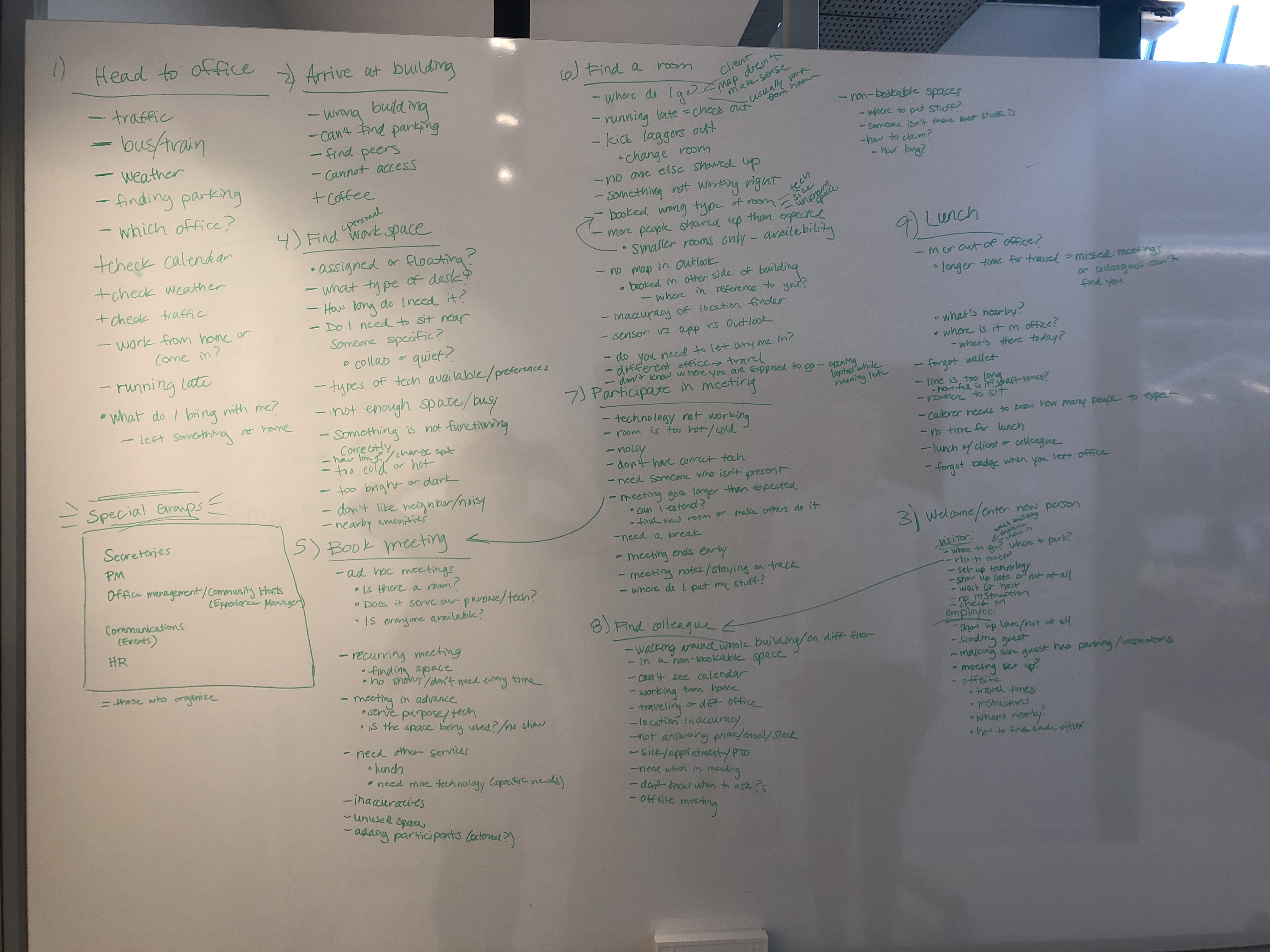
Until we were able to scale the team, I was the sole designer throughout several iterations and product releases. After returning from Amsterdam, using the findings from understanding users from that location and our current Nike users, I mapped out all of the user issues while establishing user personas (and working types on a separate board), and then mapped them against major user actions and objectives.
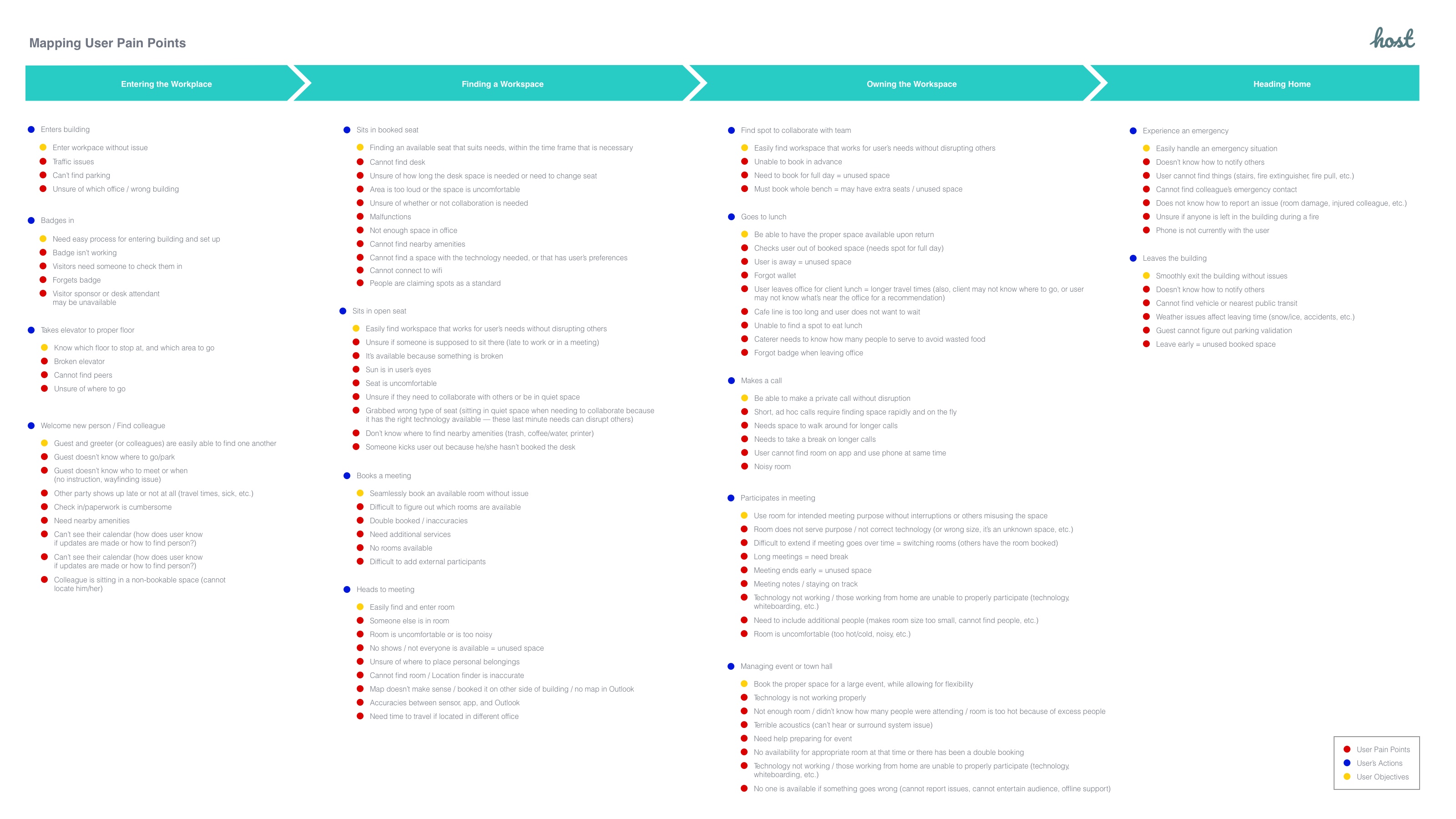
To help the team understand the user, a visual user journey (which referenced each persona type using a different colored dot) was created for the entire team to reference.
Then, I mapped out the pain points that were heard against the user flow.
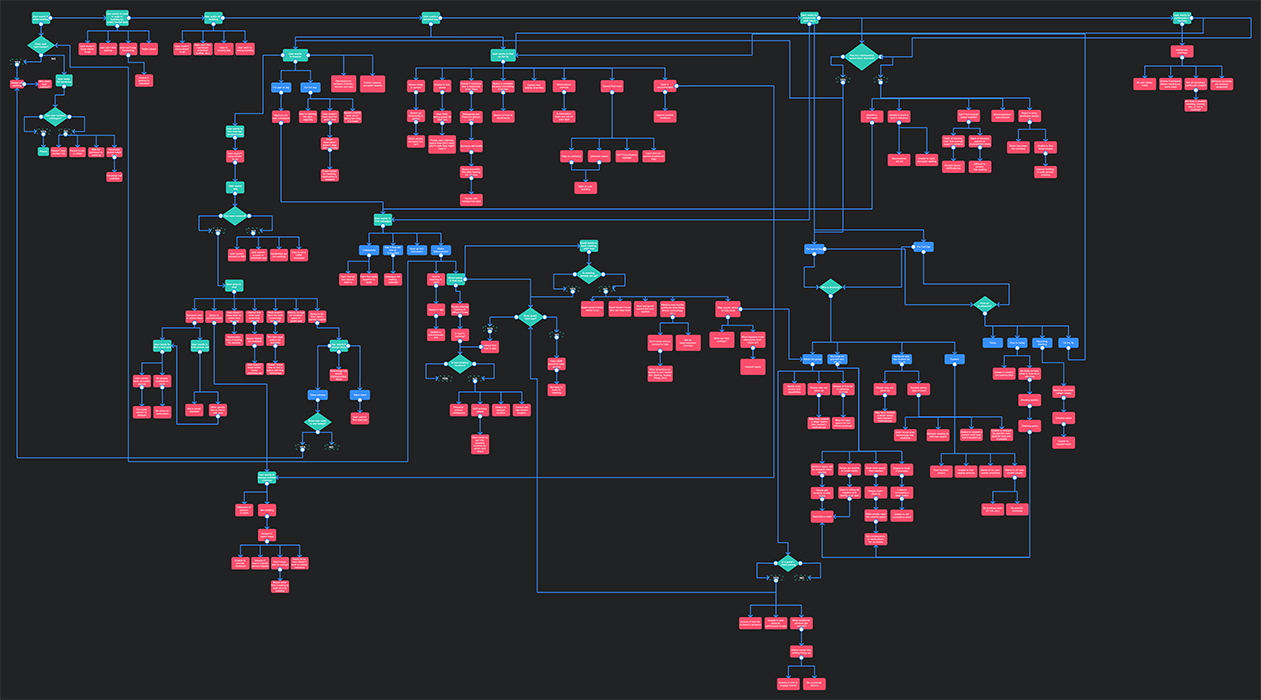
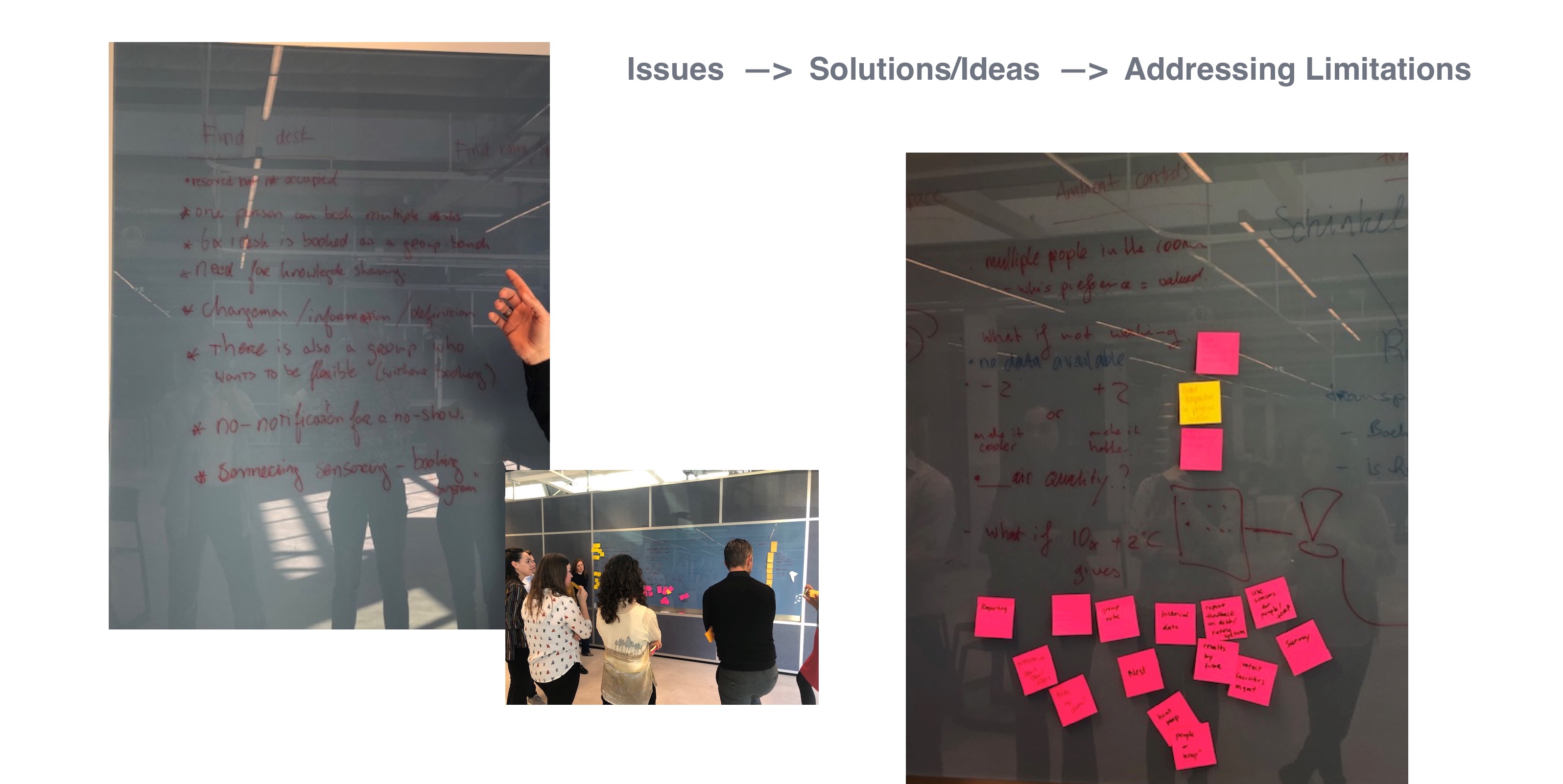
From there, we used our discussions and workshops with multiple groups of users to annotate potential solutions and pain points within their current workflows, and turned the red paths of pain points and challenges into purple solutions and opportunities along the user flow.
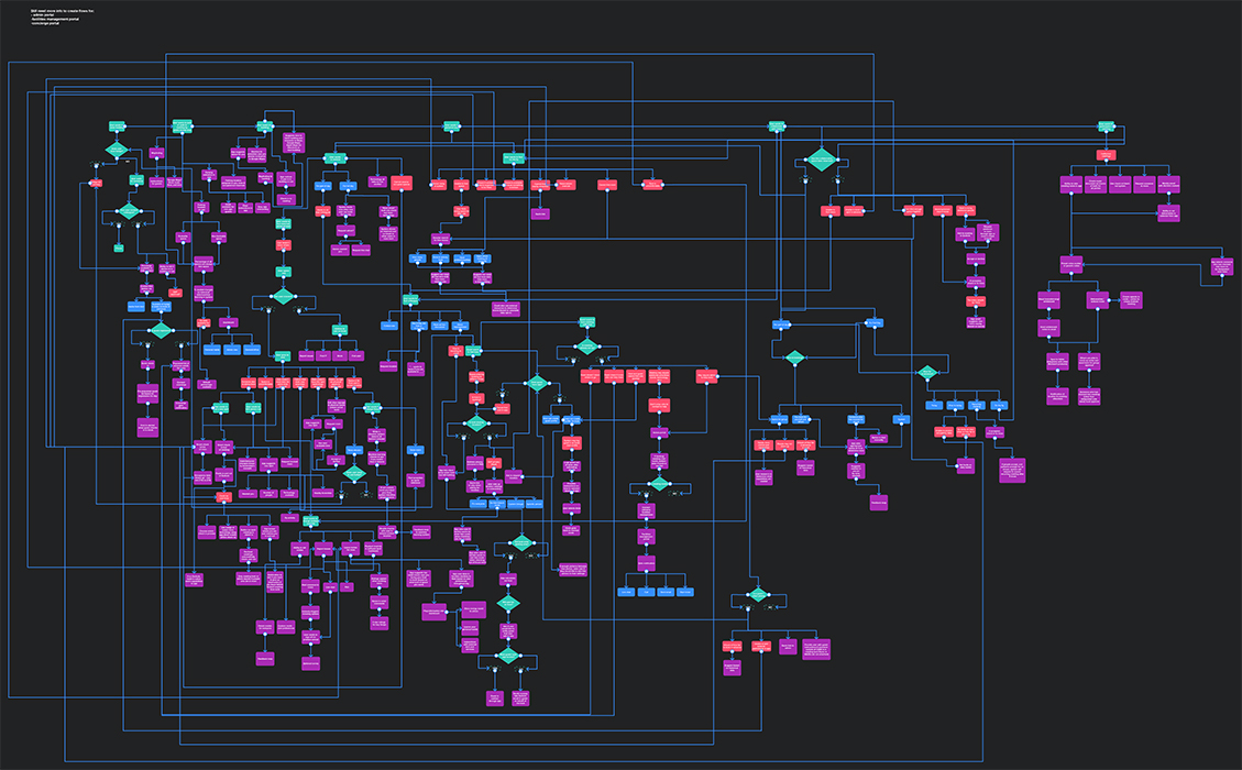
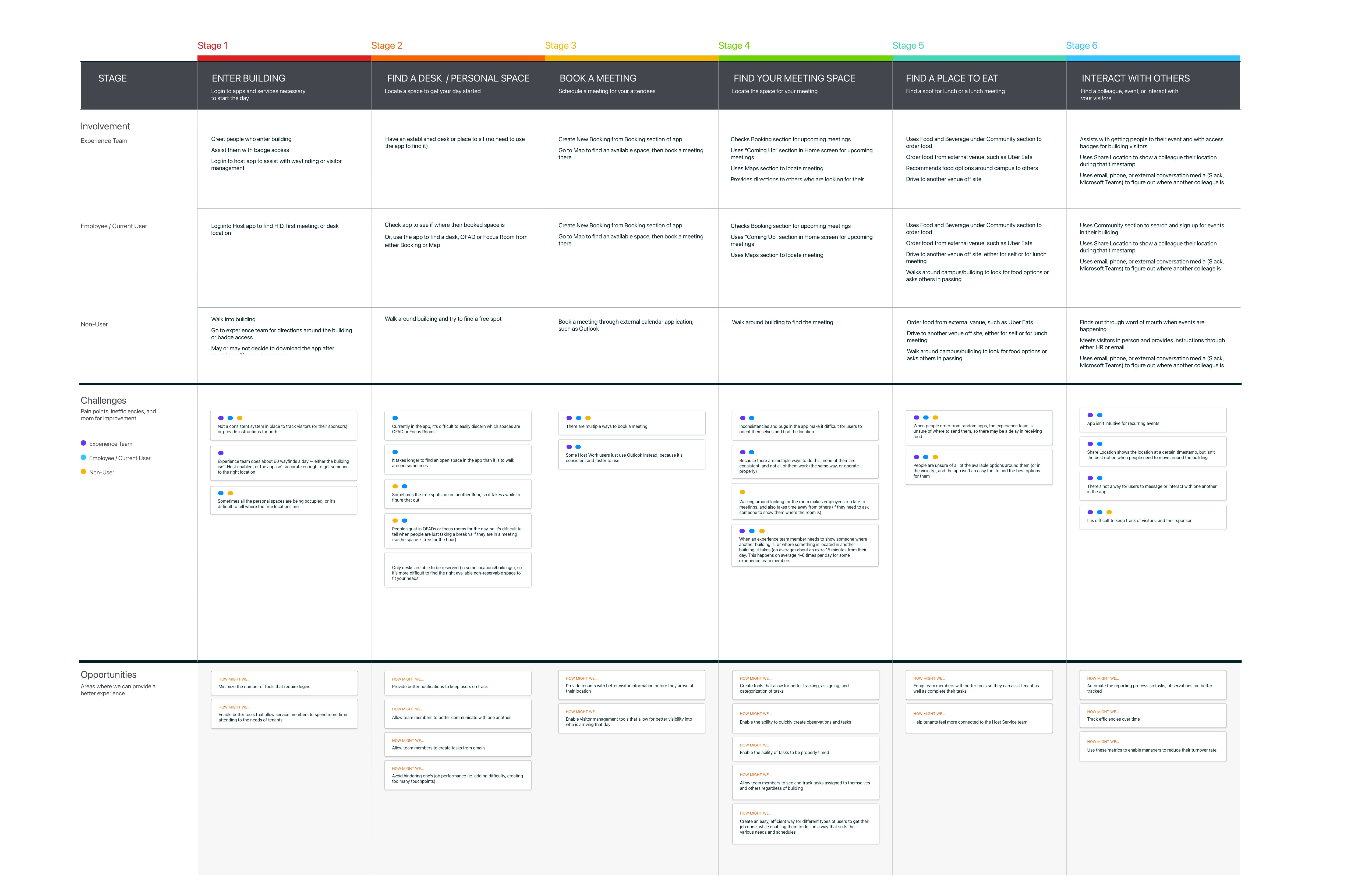
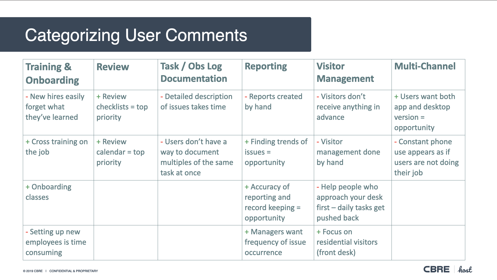
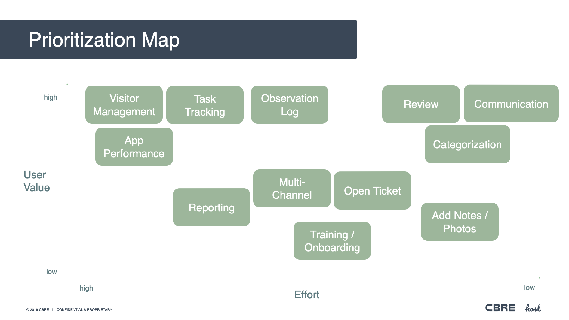
Streamlining Processes
After chatting with the product team, engineering lead, and data science lead, we later used this board to narrow down these proposed new paths into our MPV after poking holes in each potential solution to determine which direction to take. The beauty of this board was that we could remove specific paths and understand how they would affect other paths along the journey, and easily evaluate that impact.
Using that board and discussions with the key stakeholders, our team determined a basic draft of MVP, as well as main priorities for upcoming iterations.
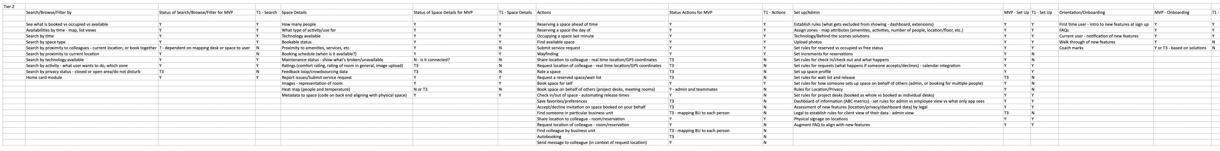
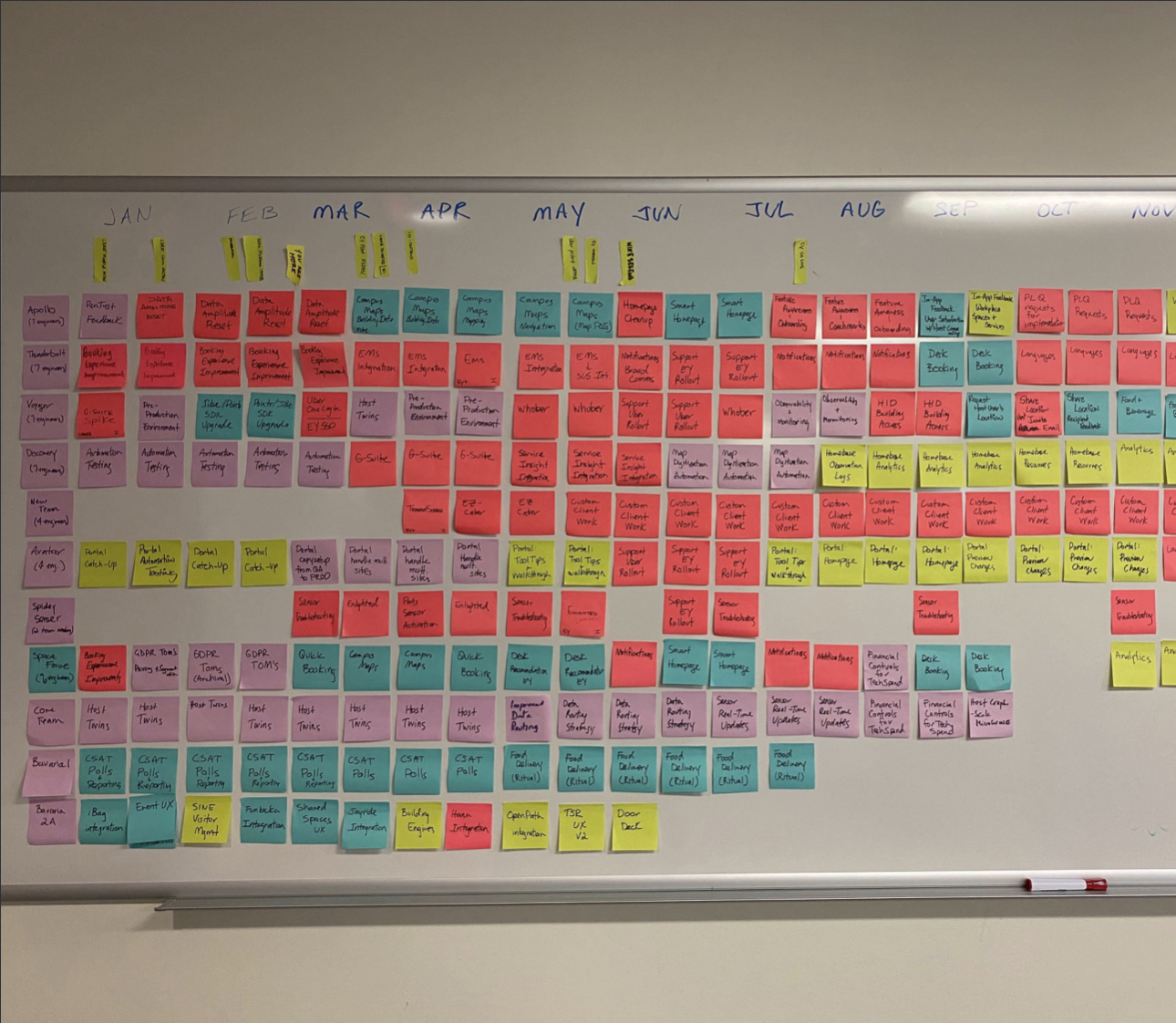
On a regular basis, our team re-evaluated these needs. As the team grew, it was easier for our UX designers and researchers to plan ahead on initial research, usability testing, and collaboration with the engineering teams. As you can see, I started with the team in February, and we needed to do a lot of foundational work before we released the Desk Booking feature. It was originally slated for a July release, which we were able to release smaller pieces and a working prototype by then, but the full engineering release happened later.
To prepare the team for MVP, we held multiple sketching sessions with entire design team, then had devopers come in for feedback after a round of crazy 8s, and then evaluated our final rounds of storyboards with product and data science teams to ensure that we were on the right track with concepts.
Articulating with Developers
Our team then evaluated proper workflows and began prototyping, creating documentation and review sessions with our deveopers. While working through more iterations, we were able to collaborate with our local engineering teams to discuss user workflows and pathways, which also went through several iterations.
But as the teams grew to multiple engineering teams across the globe, both internal and outsourced teams, it became tougher to keep track of the organization, as well as a simultaneous transition of tech stack, which created difficulty in knowing which version was the most recent. Communication and version issues then led us to work directly with our tech leads on alignment - we delivered prototypes, and the tech leads then worked with their teams as the key point of communication across all engineers on the latest versions and how the prototypes behave. Any questions came through the tech leads as the main point of contact, which streamlined our processes.
Documentation and Source of Truth
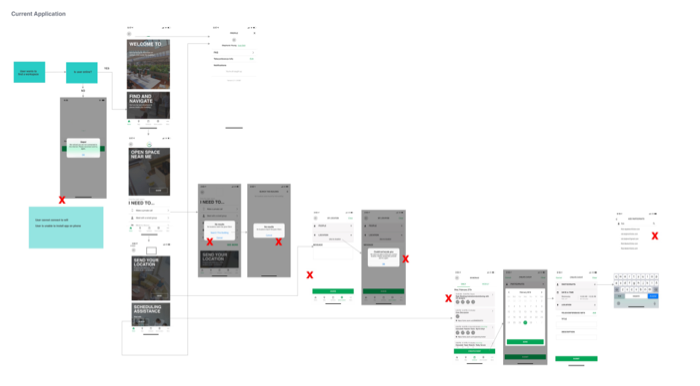
For our own reference, we mapped the ecosystem and flows for all to reference, including a master, and each use case flow.
We had to rethink flows and likely edge cases, since the project would be launched globally. Booking a room and adding people to the room was often a challenge for users during testing, so we reworked those flows (searching for colleagues, ensuring that you selected the right people, ability to go back if you selected an incorrect person, ability to see the list, still having access to book the room, etc.).
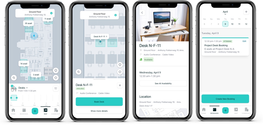
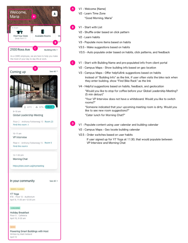
As we collaborated with developers to create working prototypes to illustrate user flows to communicate the user experience from an interactive standpoint, which we used to test new flows with users. The collaboration and live action also made it easier than static flows and design reviews with the team before sprint demo. Here are some of the final screens that were launched for MVP:

Solution and Impact
The updated app was rolled out successfully to several clients. After rollout, we had a growing client list, including Uber, along with a growing list of new product features to implement as well.
During that time, I took full ownership of developing Research Ops for the Host team, which included streamlining processes, tools, templates, reoports, and creating an easy to use repository.
As our design team started growing, I led research while collaborating with our product team on product strategy and vision for the next phases, which included room booking, a new application for service requests, and prioritization of new features based on user feedback.
ML and AI Integrations
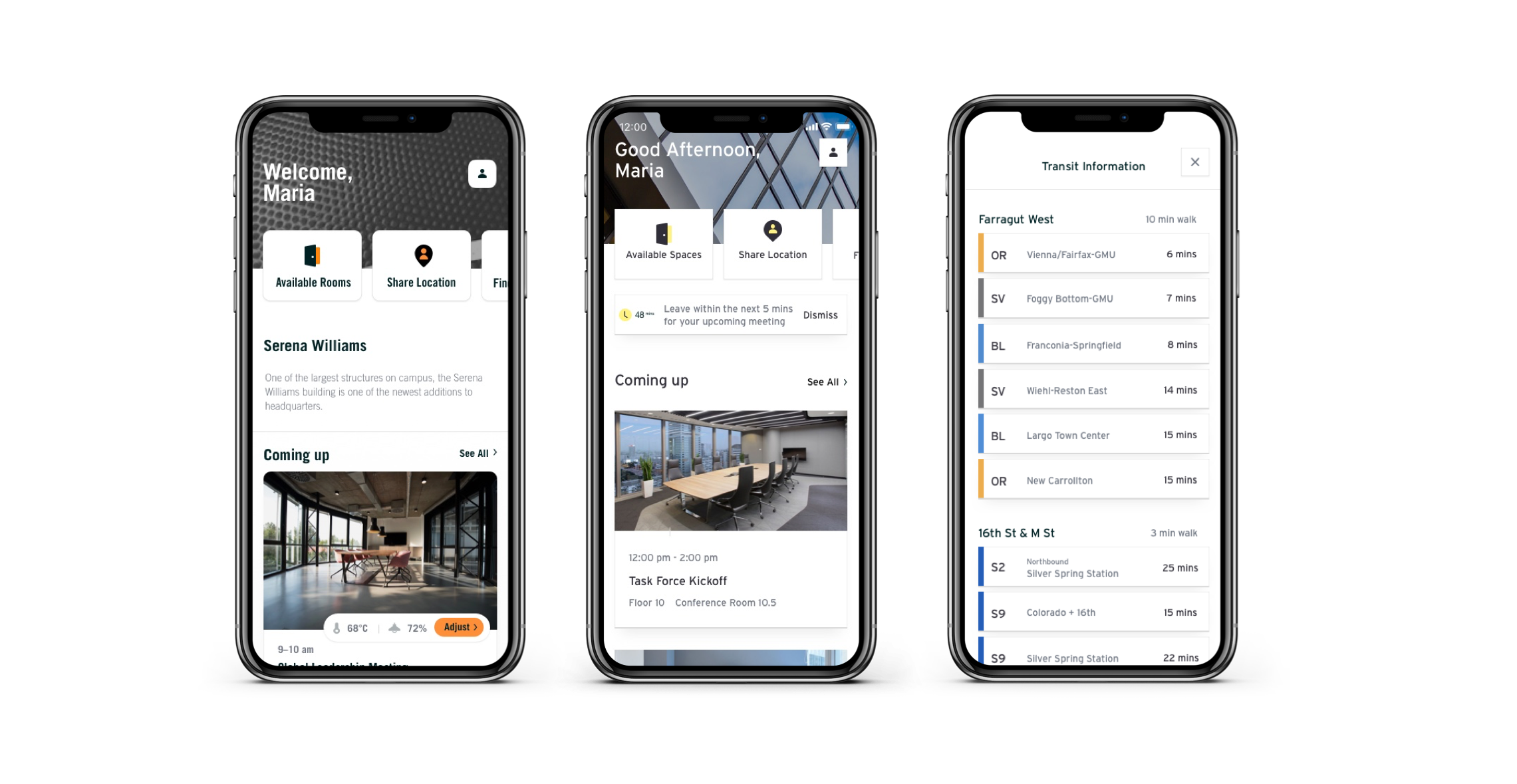
The next phases also included working with the data science team (and legal) to gather and use data from user interactions to customize the app to save users time based on common repeated actions. I partnered closely with the data science team and product managers to create strategy on which areas to build the base model for machine learning, so that these features could become smarter over time to suggest rooms, room temperatures, time to leave, and more based on gathered user data. I developed a visual for the team to digest our our proposed plan as an artifact of our collaborative sessions:
We also were able to use motion sensors and IoT magic to detect if people were physically in a room, which would better inform users if that room is empty for booking on the fly.
White Label and Client Expansion
As the project developed, Host became a white label workplace solution that would be rebranded to for each client's look and feel (EY, Uber, Nike, etc.) as additions of new features became tailored to clients' specific needs based on the company and location, including campus maps, adjustments of room temperature and lighting, service requests, and RFID building access.